SOAPTM
  • Work
  • Soapbox
  • About
  • Contact

Parker & Co. Eyewear brand development

  • Work
  • Soapbox
  • About
  • Contact

High-fashion eyewear retailers Parker & Co. operate in a highly competitive market. They recognised the need to clearly differentiate their eyewear brand from their competitors to further grow their customer base – and their bottom line.

We worked together with Parker & Co to firstly clarify their value proposition and following this assessment we set about defining their point of difference.

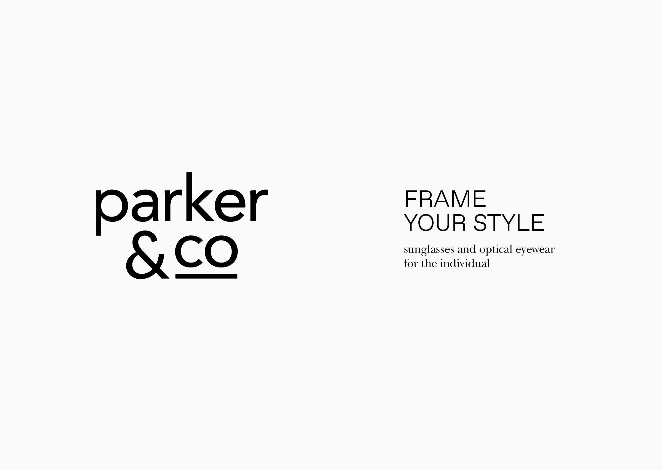
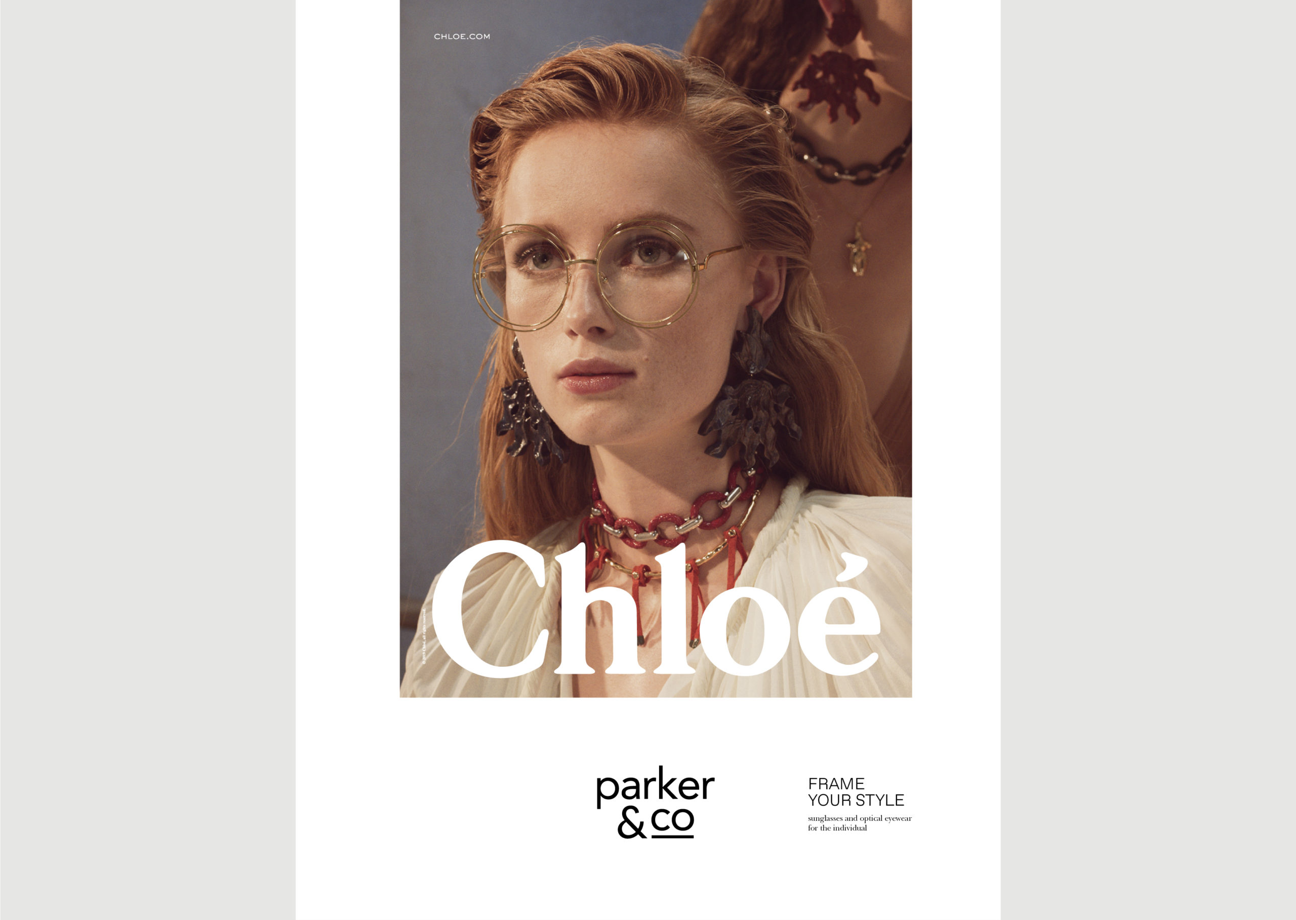
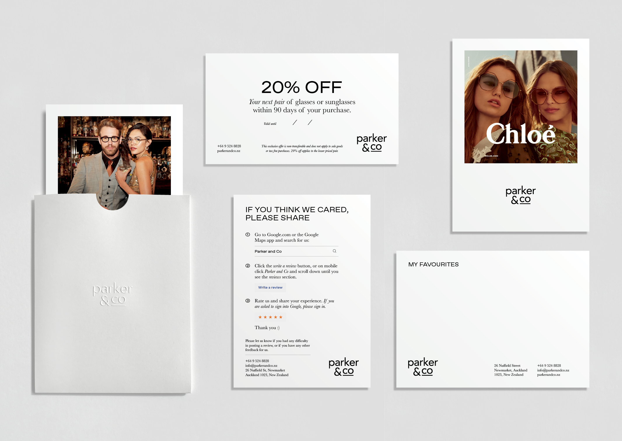
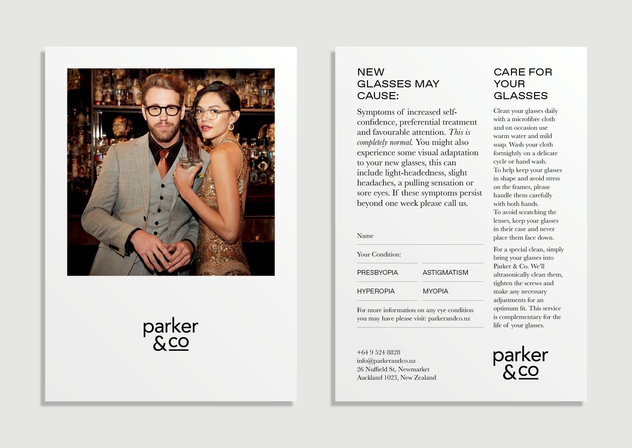
From this, a new brand statement was introduced to describe their unique abilities to style and understand the aesthetic of each customer: ‘Frame your style – sunglasses and optical eyewear for the individual’. We used this statement to also introduce a unique new offering to the business – dedicated personal styling sessions.

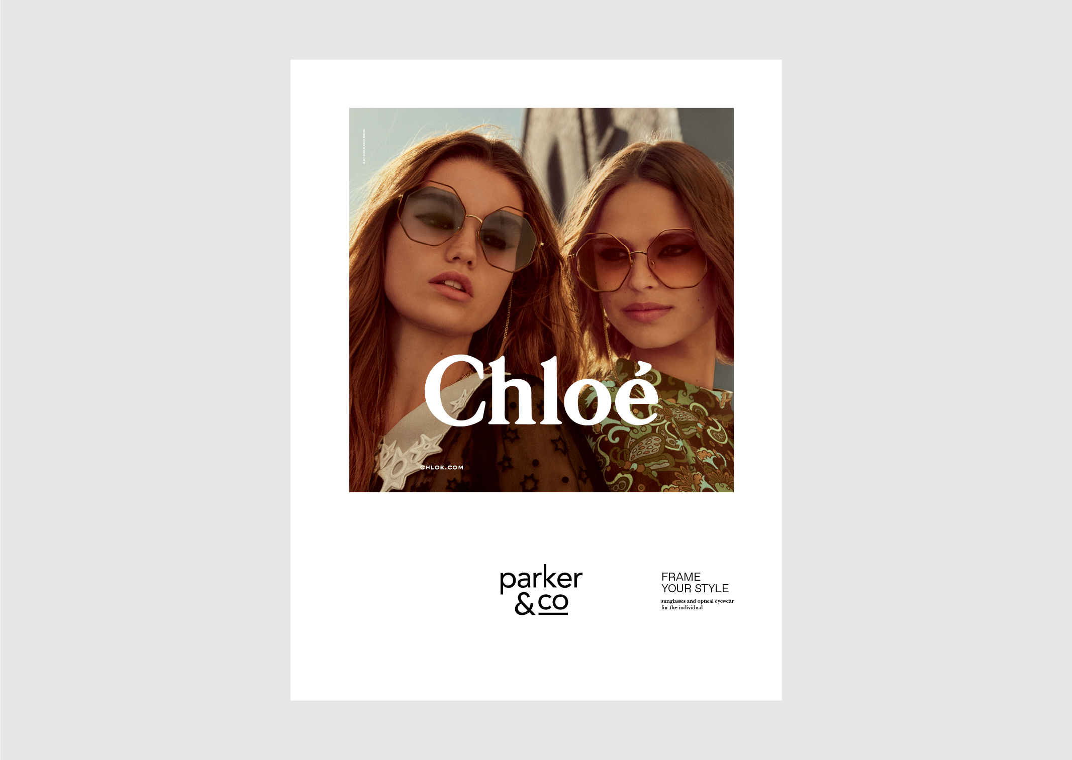
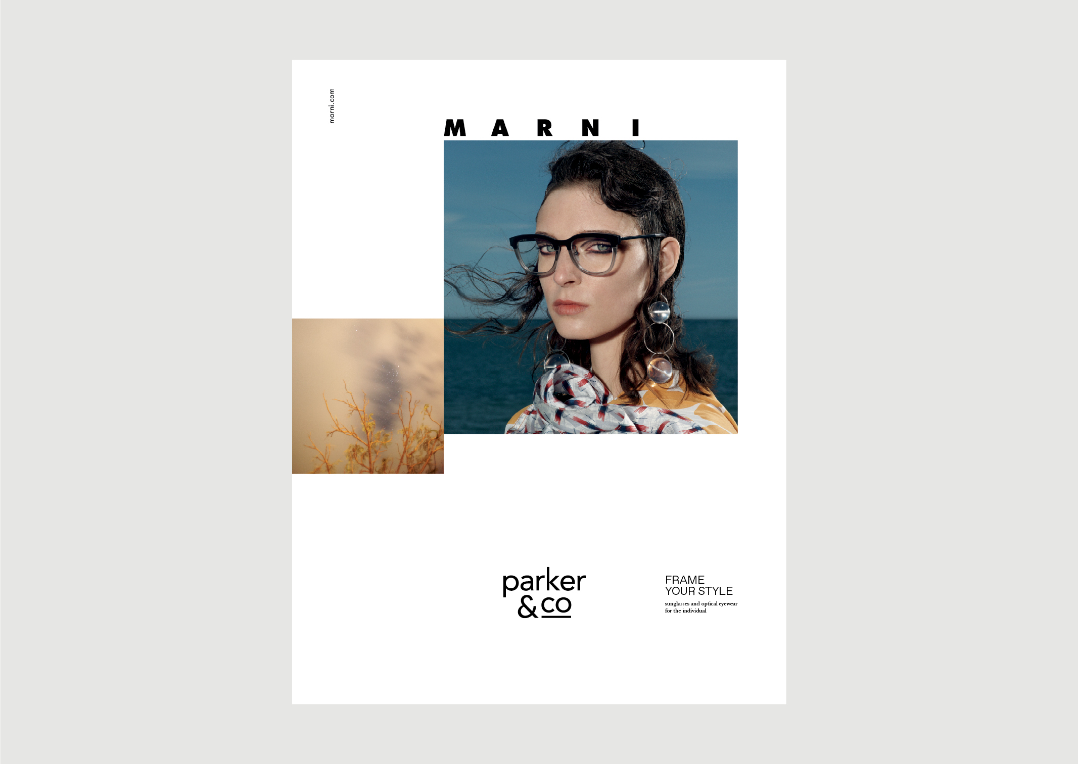
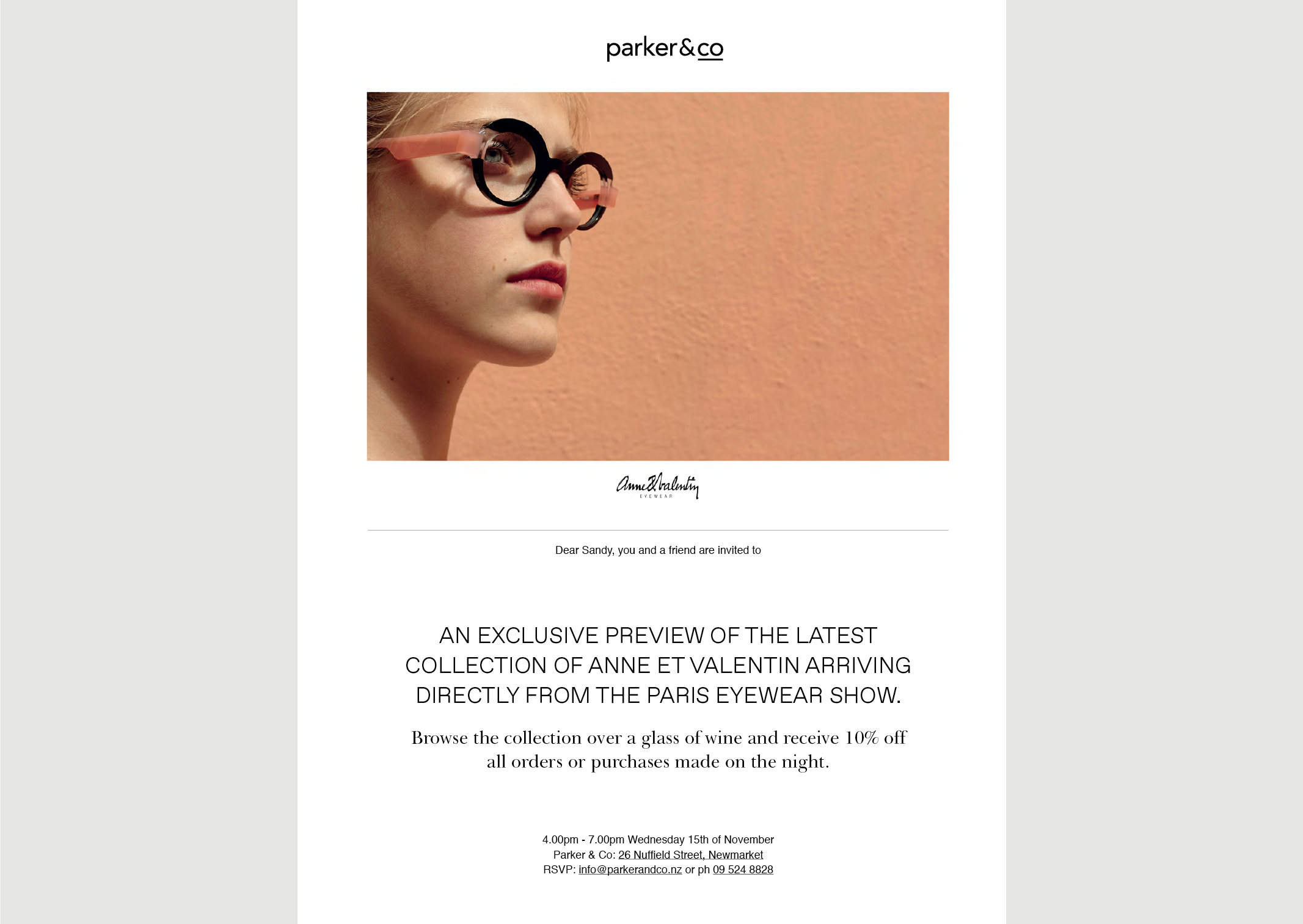
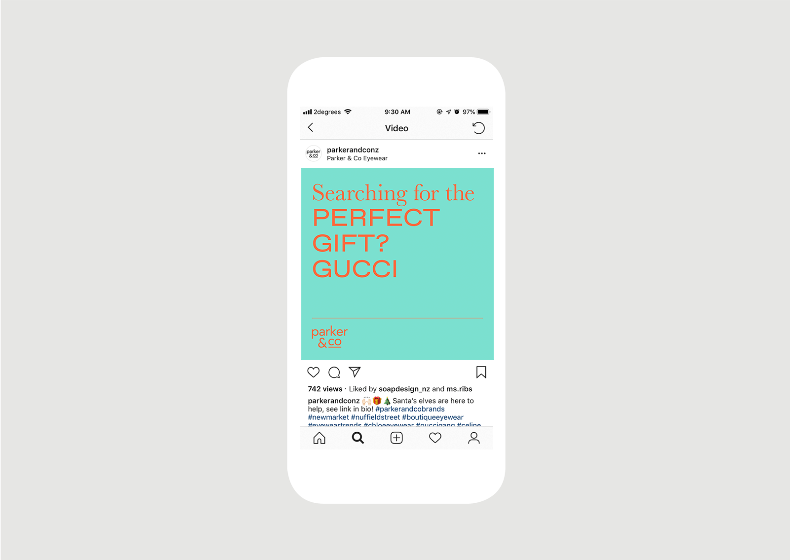
A new brand language was created to support the styling focus; we introduced a pairing of extended sans serif and serif typography to provide a contemporary, luxurious, fashion-forward visual tone. The typography is teamed with sumptuous campaign images supplied by the high-fashion eyewear brands they stock.

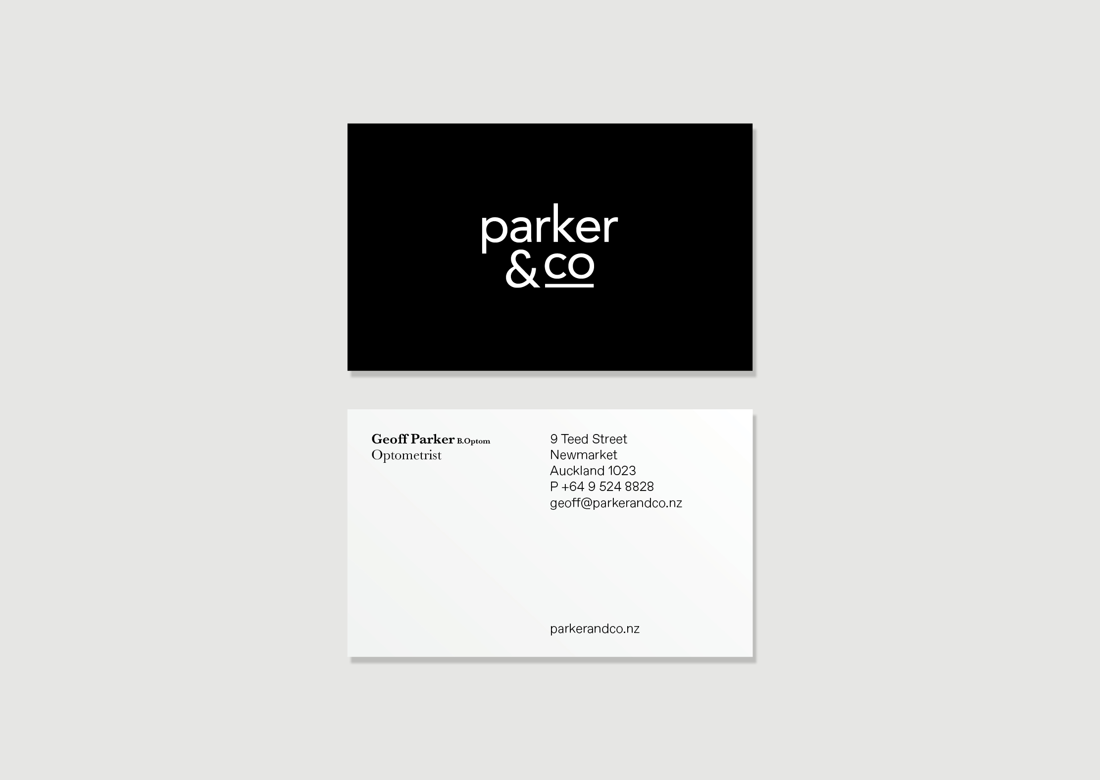
As part of the development of the brand language, we also refreshed their existing identity; in removing a cumbersome box device and redundant design elements we created a more refined logotype allowing the Parker & Co and designer brand logotypes clarity and breathing space.

We applied these brand tools within further designer brand applications such as their advertising campaign within Denizen magazine; consistently creating sense of luxuriousness with the pared back aesthetic.

You can see further website and campaign projects with Parker & Co.


  • Category
  • Our work
Tags Brand, Copy, Identity, Print
Share this —
FacebookMessengerTwitterLinkedInPinterest
Recent Posts
  • Koh: a bold brand refresh
  • 3 Te Kehu Way Development Hoarding
  • 3 Te Kehu Way Development Hoardings
  • Retail Graphics – Sylvia Park Level 1 launch
  • 3 Te Kehu Way
Recent Comments
    Archives
    • January 2024
    • February 2022
    • January 2022
    • September 2021
    • July 2021
    • June 2021
    • January 2021
    • December 2020
    • August 2020
    • May 2020
    • March 2020
    • February 2020
    • January 2020
    • November 2019
    • August 2019
    • July 2019
    • June 2019
    • February 2019
    • December 2018
    • July 2018
    • June 2018
    • April 2018
    • February 2018
    • January 2018
    • November 2017
    • September 2017
    • August 2017
    • July 2017
    • June 2017
    • April 2017
    • March 2017
    • February 2017
    • January 2017
    • October 2016
    • August 2016
    • July 2016
    • May 2016
    • July 2015
    Categories
    • Our work
    • Soapbox
    Meta
    • Log in
    • Entries feed
    • Comments feed
    • WordPress.org
    Parker and Co refined identity – simplified and streamlined sans serif typography
    Parker and Co Eyewear – Frame your style – positioning line
    Parker and Co Eyewear – Denizen Ad – featuring Chloe 2018
    Parker and Co Eyewear – Denizen Ad – featuring Marni 2018
    Parker and Co Eyewear – Denizen Ad – featuring Chloe 2019
    Parker and Co Branded Pocket – close up of blind emboss – white on white
    Parker and Co Business cards – Optometry Geoff Parker Optometrist with logo on black background
    Parker and Co Branded Pocket – blind embossed – white on white
    Parker and Co Branded Pocket – blind embossed – contains customer post sale information and voucher
    Parker and Co Branded Postcard – customer point of sale touchpoint – features Moscot brand image and after sales information
    Parker & Co EDM Anne et Valentin Eyewear exclusive preview – desktop view – features dramatic view of eyewear
    Parker and Co Xmas Perfect Gift campaign animated text on mobile screen
    Koh: a bold brand refresh
    Koh Brand refresh emotive photography showing boy with mischievous expression with red hair in a light, bright, kitchen environment
    3 Te Kehu Way Development Hoardings
    3 Te Kehu Way Commercial Property Development Hoarding showing core marketing and leasing messaging featuring architectural render seen through dappled sunlight and tree branch shadows 3 Te Kehu Way Commercial Property Development Hoarding showing building image and messaging on green background
    Carbon Method CrossFit branding
    Carbon Method CrossFit Logo Wordmark Branding Identity Weight lifting
    Back to Our work
    SOAP™

    Social

    • Instagram
    • Behance
    • Pinterest
    • LinkedIn

    Contact

    • +64 21 722 335
    • katie@soapdesign.co.nz

    Copyright

    • ©SOAPTM
    • All rights reserved
    • Terms and Conditions