SOAPTM
  • Work
  • Soapbox
  • About
  • Contact

Koh: a bold brand refresh

  • Work
  • Soapbox
  • About
  • Contact

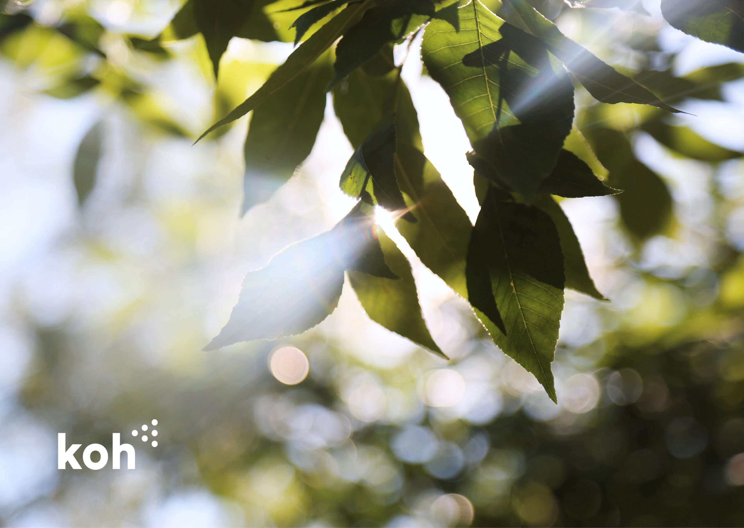
When Koh, the eco-friendly cleaning brand, approached us for a brand refresh to align with their global expansion, we knew how to help them stand out. Koh’s sustainable cleaning products had made their mark worldwide, and they needed an updated brand identity that reflected their playful nature, scientific approach, and eco-conscious ethos.

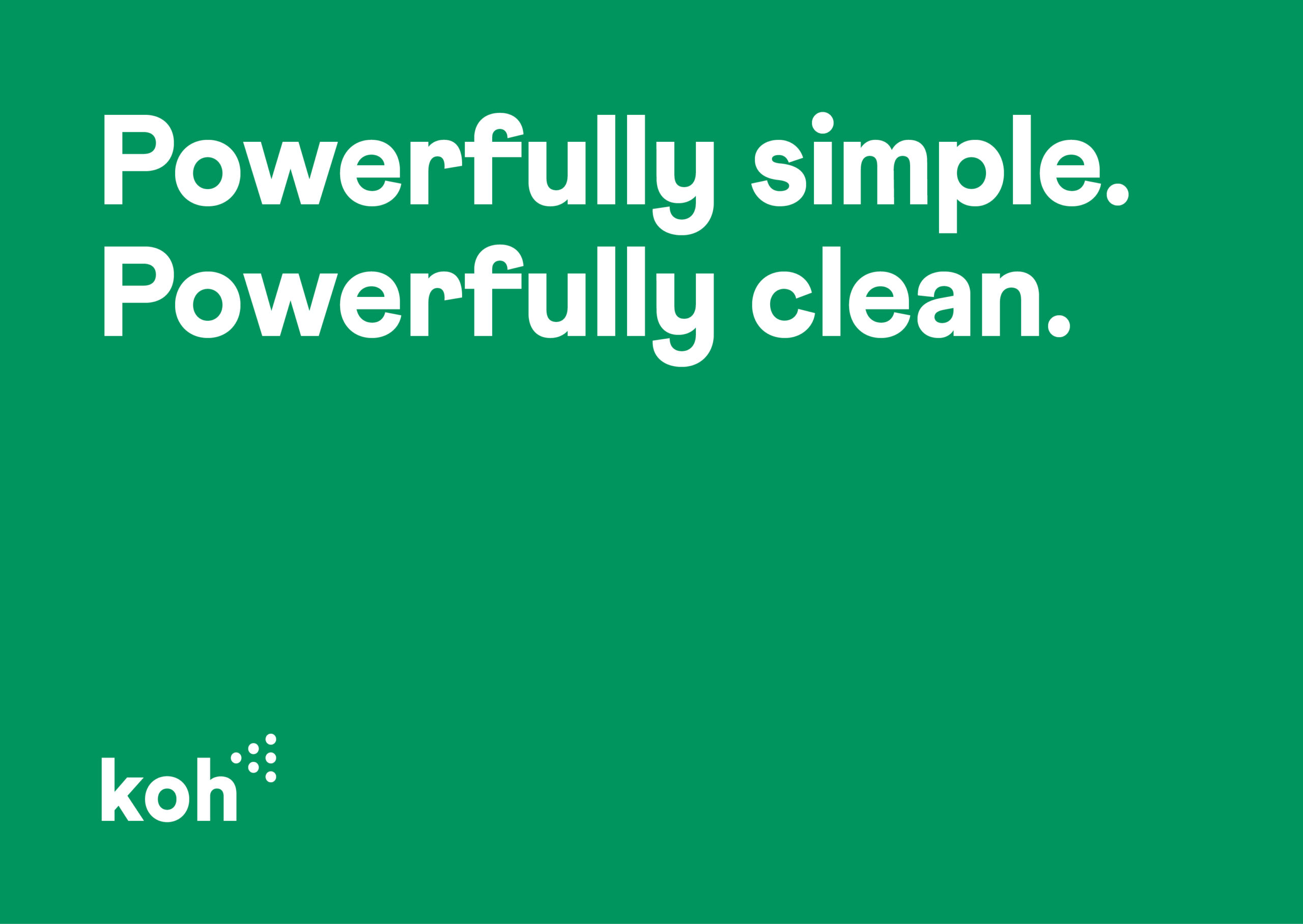
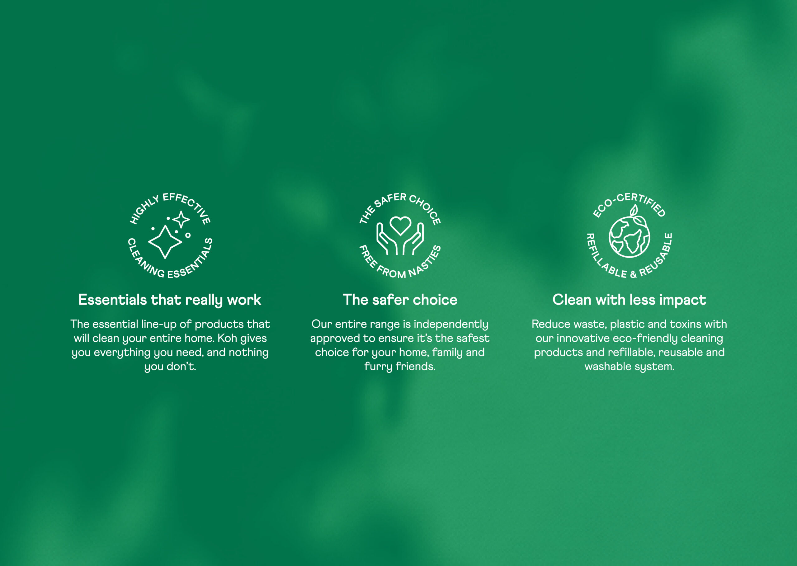
We started by developing a bold brand positioning that defined Koh’s point of difference: science-driven, eco-friendly cleaning products that are as effective as they are sustainable. This was complemented by custom-designed icons and clear, concise copy that showcased their environmental commitment and the science behind their products.

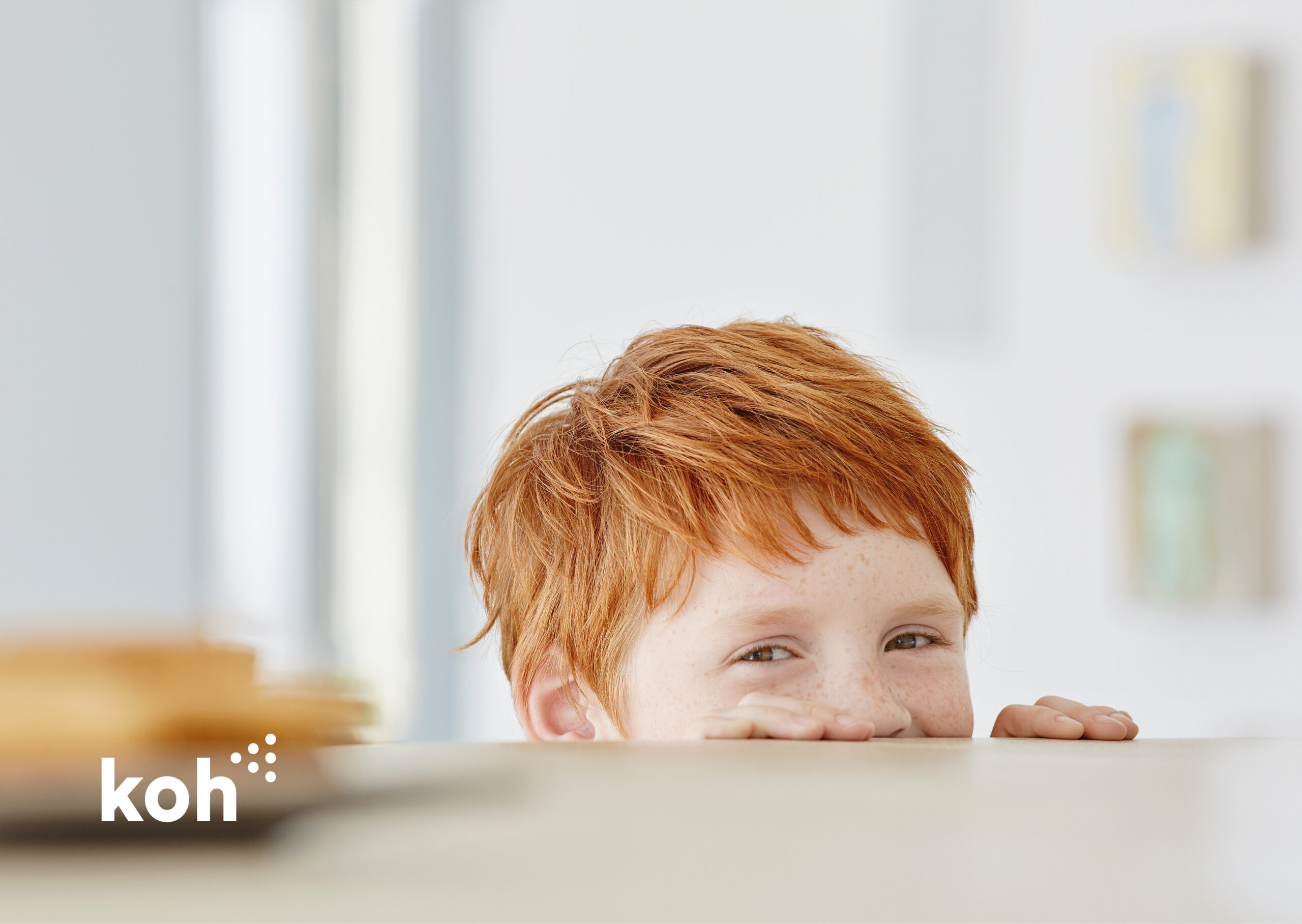
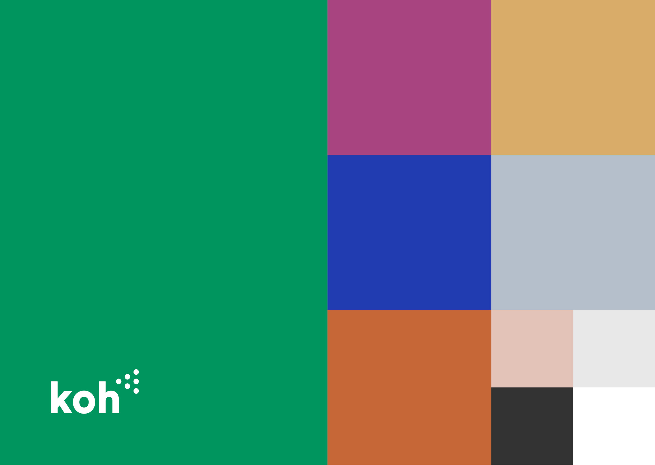
To drive engagement with their audience, we created a visual system that combined functional imagery with emotional appeal. The result was a brand refresh that effectively communicates Koh’s values through impactful design and clean, crisp visuals that highlight their product range.

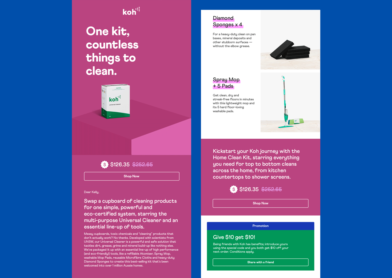
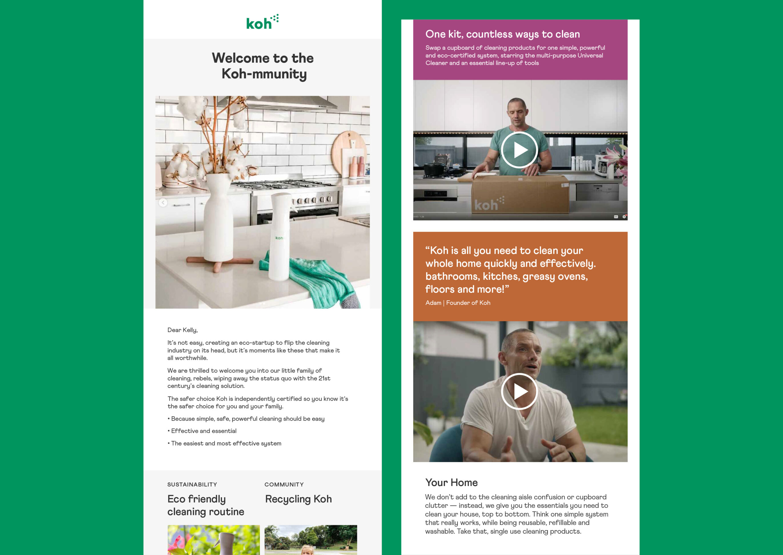
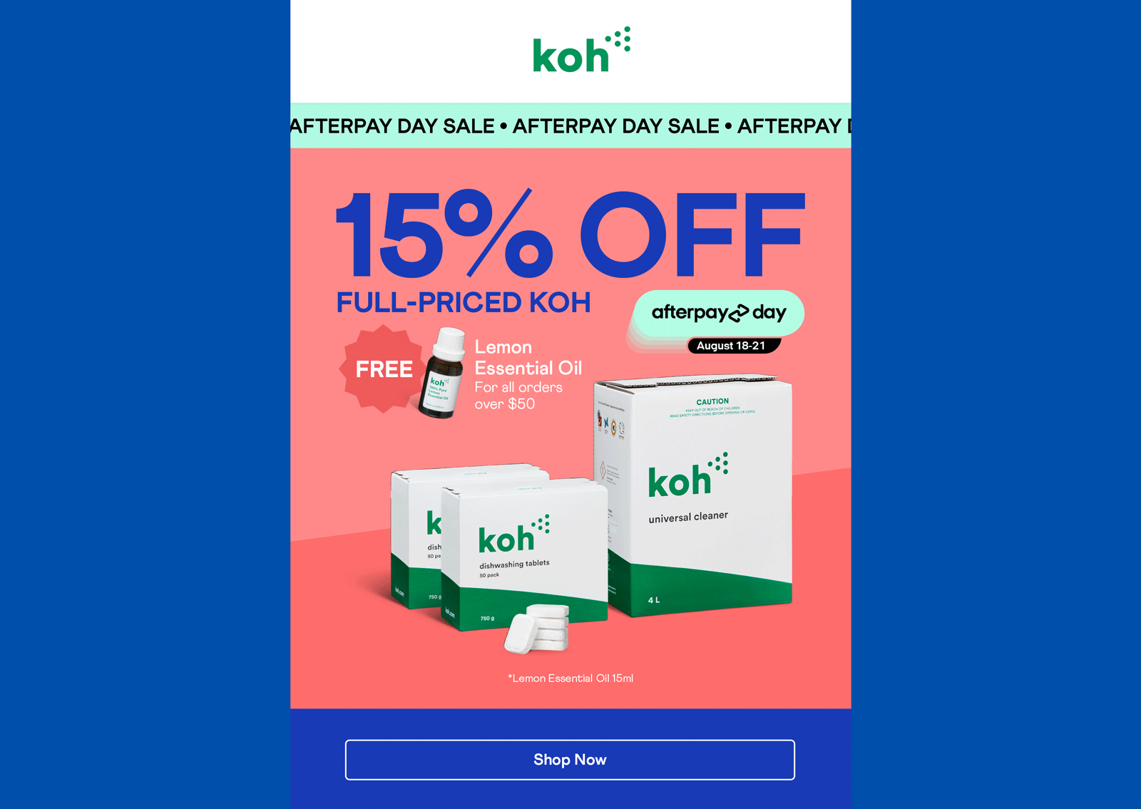
Our work extended to creating direct marketing campaigns, including eye-catching EDMs (email campaigns) designed to reach new and existing members of the Koh community—also known as the Koh-mmunity. These campaigns were crafted to increase customer engagement and awareness of Koh’s eco-friendly solutions.

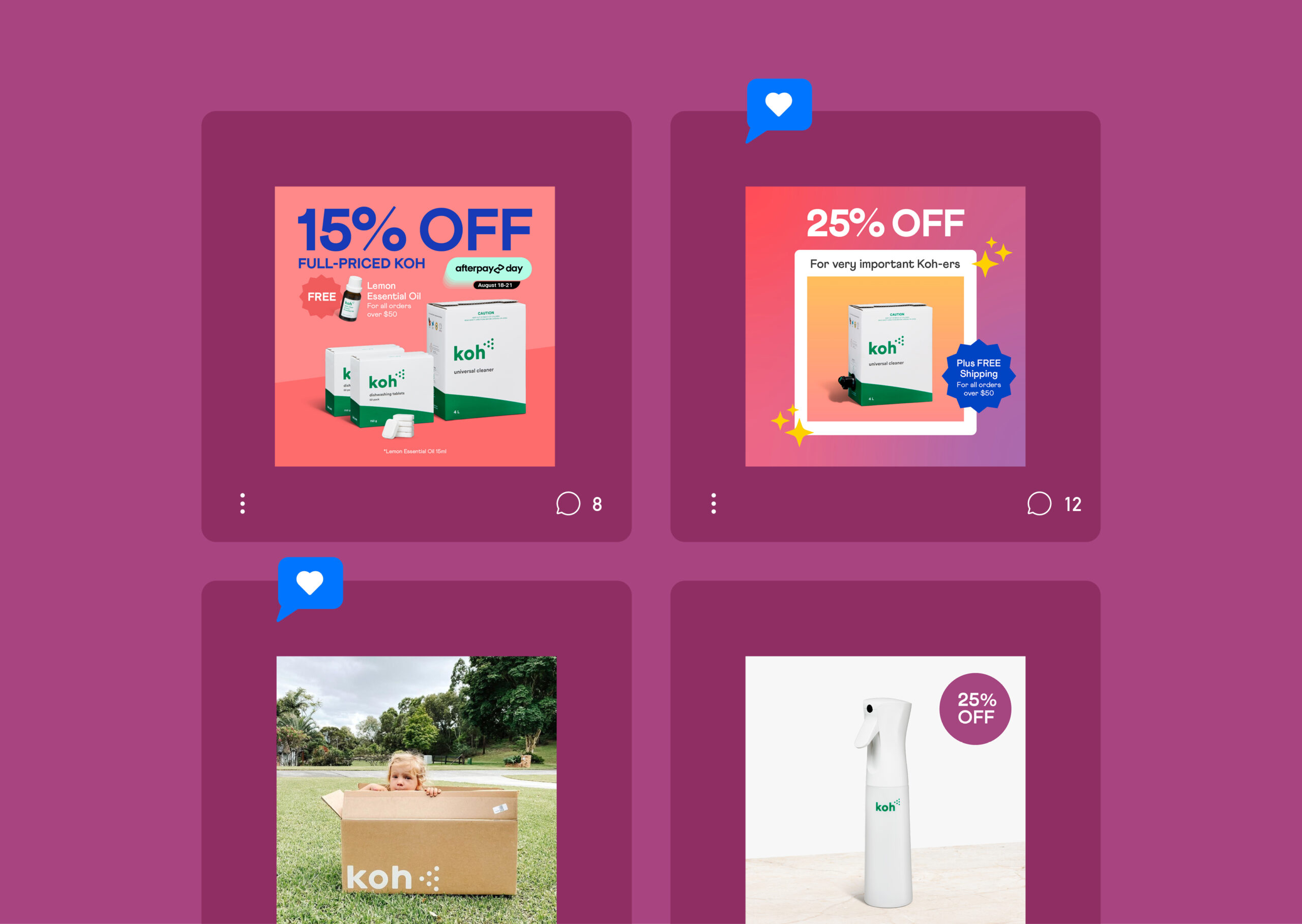
We also applied this brand refresh to Koh’s social media presence, using their updated colour palette and playful animations to create engaging, shareable content.

By incorporating vibrant imagery, dynamic product shots, and friendly, eco-conscious messaging, we helped Koh enhance their social media engagement and effectively communicate their mission across all platforms.

Discover how we can help refresh your brand to better reflect your values and drive customer engagement. Explore our projects here and here.


  • Category
  • Our work
Tags Brand, Copy, Social
Share this —
FacebookMessengerTwitterLinkedInPinterest
Recent Posts
  • Koh: a bold brand refresh
  • 3 Te Kehu Way Development Hoarding
  • 3 Te Kehu Way Development Hoardings
  • Retail Graphics – Sylvia Park Level 1 launch
  • 3 Te Kehu Way
Recent Comments
    Archives
    • January 2024
    • February 2022
    • January 2022
    • September 2021
    • July 2021
    • June 2021
    • January 2021
    • December 2020
    • August 2020
    • May 2020
    • March 2020
    • February 2020
    • January 2020
    • November 2019
    • August 2019
    • July 2019
    • June 2019
    • February 2019
    • December 2018
    • July 2018
    • June 2018
    • April 2018
    • February 2018
    • January 2018
    • November 2017
    • September 2017
    • August 2017
    • July 2017
    • June 2017
    • April 2017
    • March 2017
    • February 2017
    • January 2017
    • October 2016
    • August 2016
    • July 2016
    • May 2016
    • July 2015
    Categories
    • Our work
    • Soapbox
    Meta
    • Log in
    • Entries feed
    • Comments feed
    • WordPress.org
    Koh Brand refresh emotive photography showing boy with mischievous expression with red hair in a light, bright, kitchen environment
    Koh Brand Positioning: Powerfully Simple. Powerfully Clean. Bold white text on bright green background
    Koh Brand 3 ethos icons and copy on green background: Highly Effective, Safer Choice, Eco-Certified
    Lady in light coloured clothing wiping glass table in light and bright room
    Koh Colour Palette – combination of green, blue, tan and neutrals
    Koh EDM showing with animated image showing simple cleaning kit and individual product features in Koh colour palette.
    Koh Welcome EDM showing fresh imagery, welcome copy and explanatory videos
    Koh EDM showing with animated ticker tape for a sales promotion.Large price and promotional text and product image in bright blue from new Koh colour palette.
    Koh Social Tiles showing product and brand imagery in bold magenta frames and background
    Koh brand photography: Dappled Sun shining through leaves
    3 Te Kehu Way Development Hoardings
    3 Te Kehu Way Commercial Property Development Hoarding showing core marketing and leasing messaging featuring architectural render seen through dappled sunlight and tree branch shadows 3 Te Kehu Way Commercial Property Development Hoarding showing building image and messaging on green background
    Parker & Co. Eyewear brand development
    Parker and Co Branded Pocket – close up of blind emboss – white on white
    Carbon Method CrossFit branding
    Carbon Method CrossFit Logo Wordmark Branding Identity Weight lifting
    Back to Our work
    SOAP™

    Social

    • Instagram
    • Behance
    • Pinterest
    • LinkedIn

    Contact

    • +64 21 722 335
    • katie@soapdesign.co.nz

    Copyright

    • ©SOAPTM
    • All rights reserved
    • Terms and Conditions