High-fashion eyewear retailers Parker & Co. operate in a highly competitive market. They recognised the need to clearly differentiate their eyewear brand from their competitors to further grow their customer base – and their bottom line.
We worked together with Parker & Co to firstly clarify their value proposition and following this assessment we set about defining their point of difference.
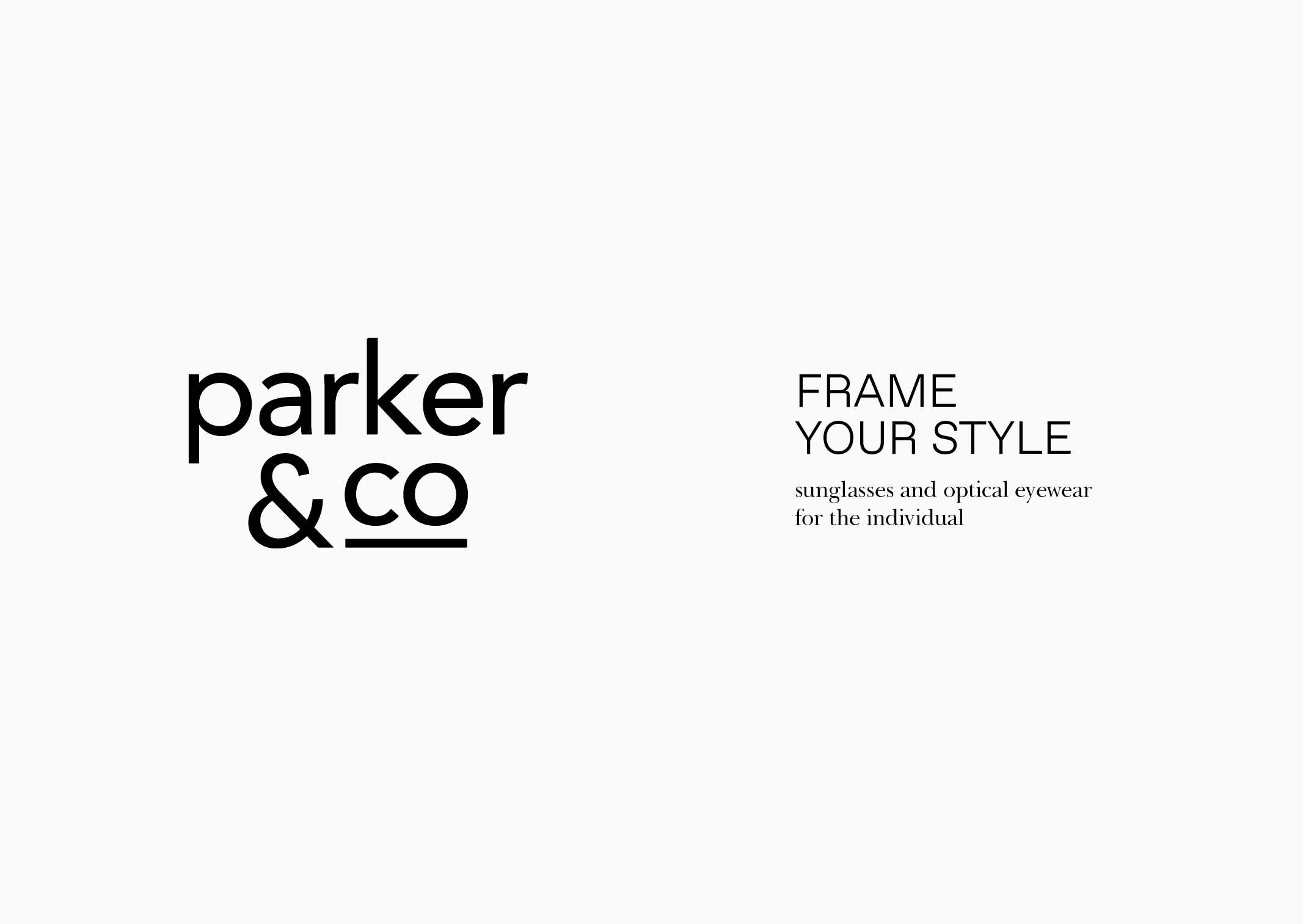
From this, a new brand statement was introduced to describe their unique abilities to style and understand the aesthetic of each customer: ‘Frame your style – sunglasses and optical eyewear for the individual’. We used this statement to also introduce a unique new offering to the business – dedicated personal styling sessions.
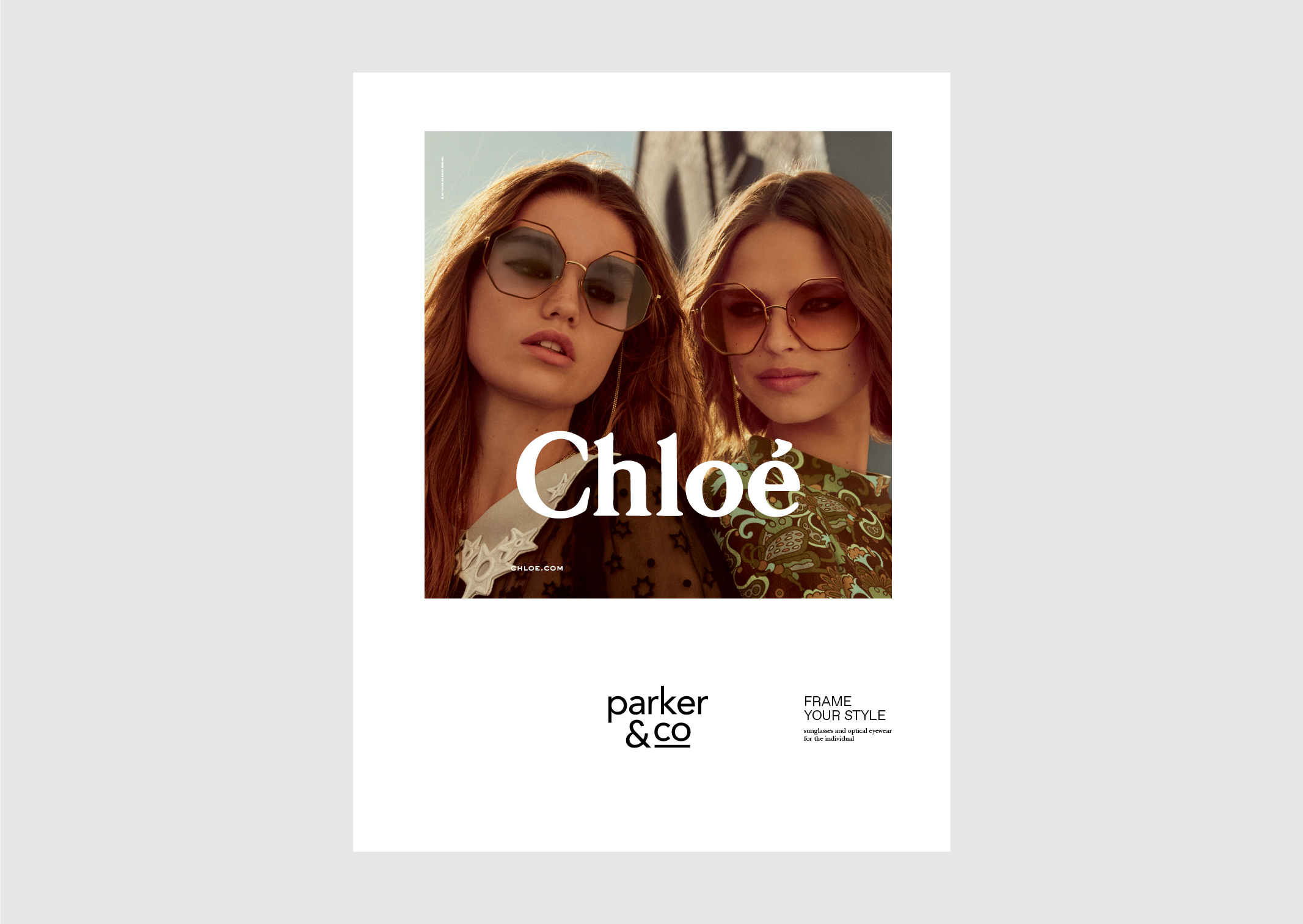
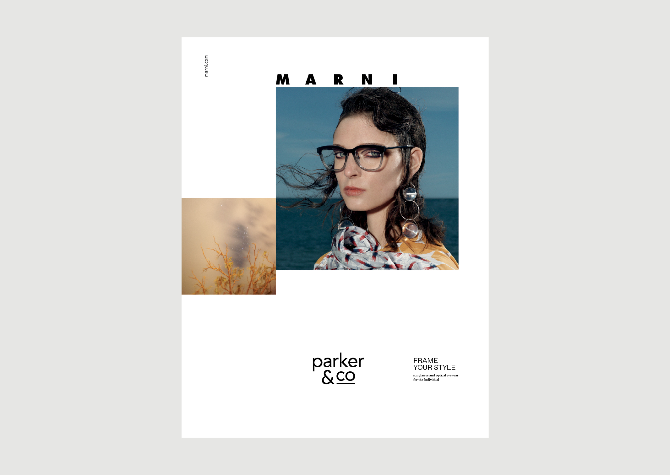
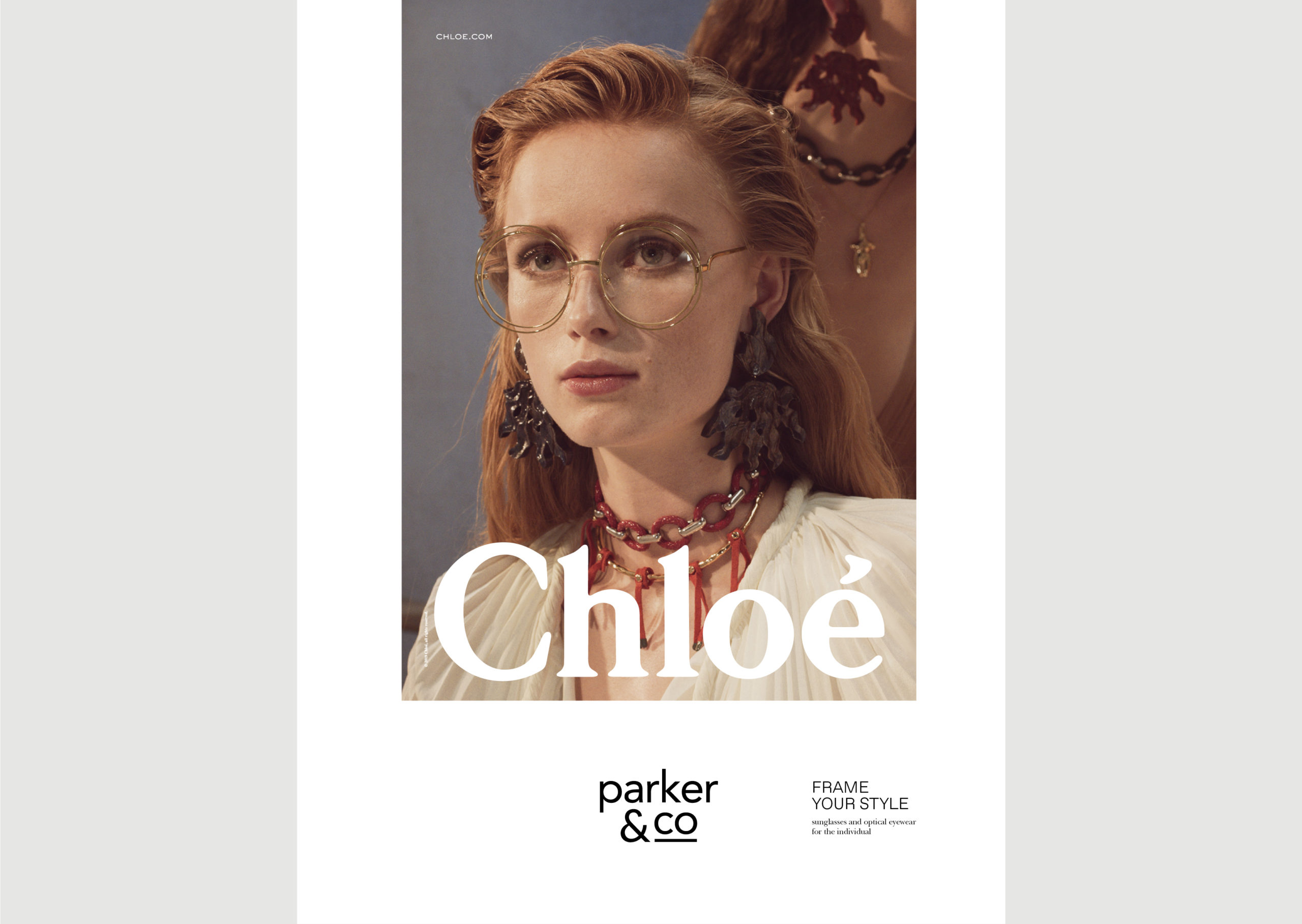
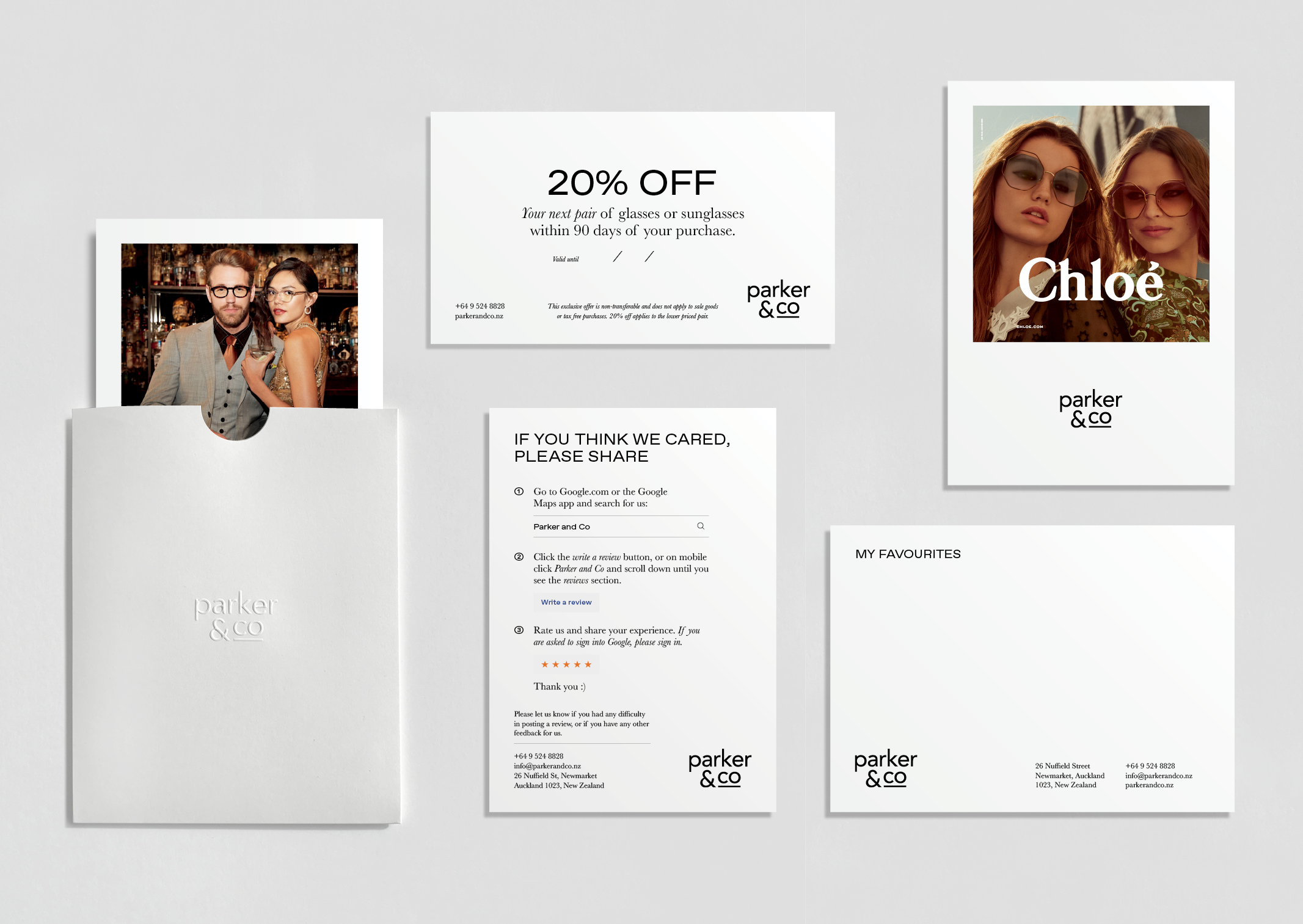
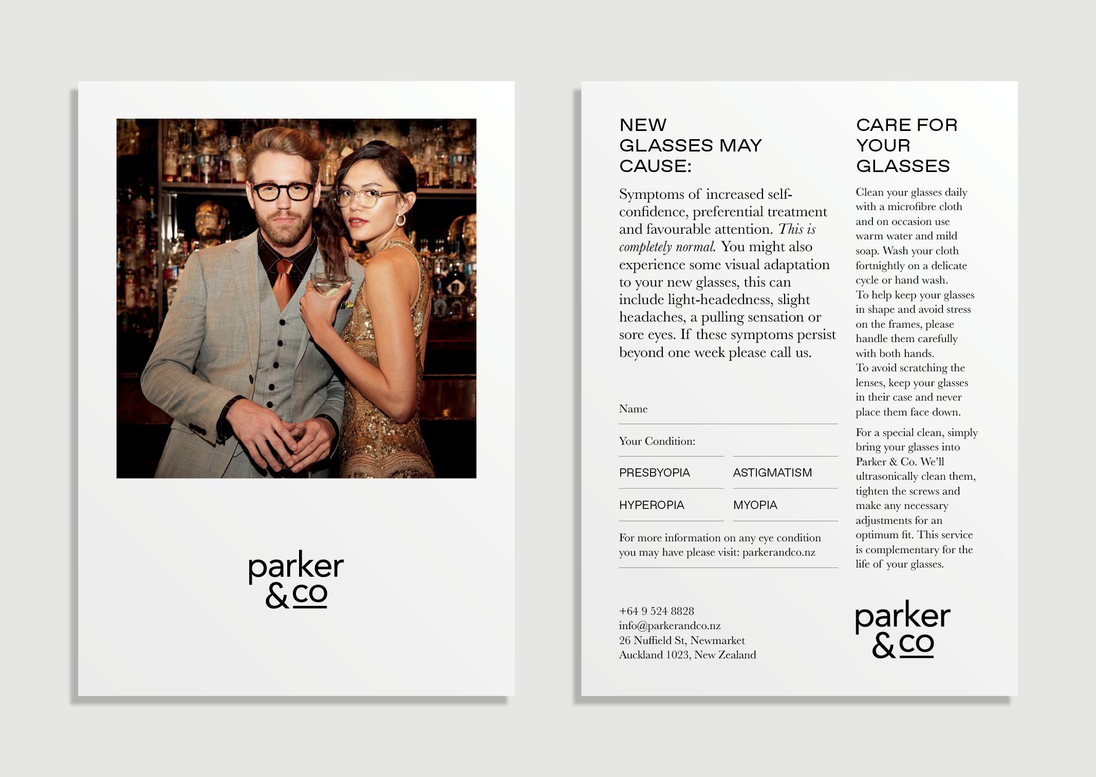
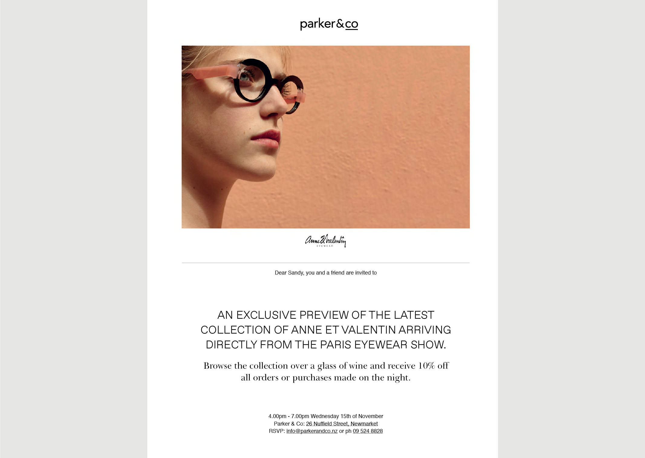
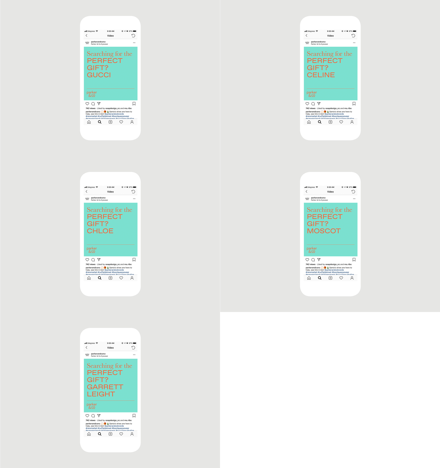
A new brand language was created to support the styling focus; we introduced a pairing of extended sans serif and serif typography to provide a contemporary, luxurious, fashion-forward visual tone. The typography is teamed with sumptuous campaign images supplied by the high-fashion eyewear brands they stock.
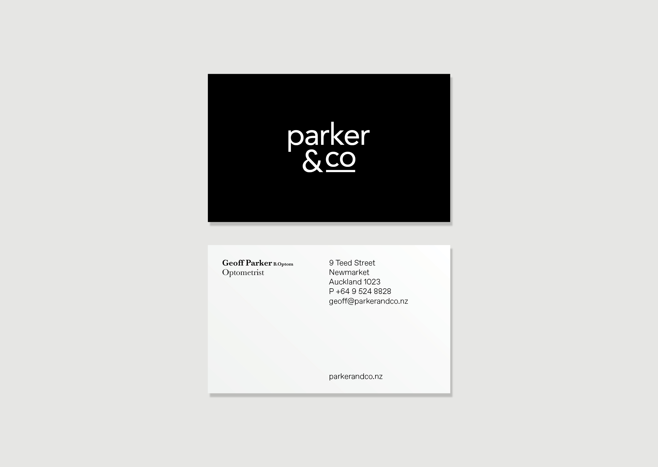
As part of the development of the brand language, we also refreshed their existing identity; in removing a cumbersome box device and redundant design elements we created a more refined logotype allowing the Parker & Co and designer brand logotypes clarity and breathing space.
We applied these brand tools within further designer brand applications such as their advertising campaign within Denizen magazine; consistently creating sense of luxuriousness with the pared back aesthetic.
You can see further website and campaign projects with Parker & Co.
