SOAPTM
  • Work
  • Soapbox
  • About
  • Contact

Sylvia Tower commercial property branding

  • Work
  • Soapbox
  • About
  • Contact

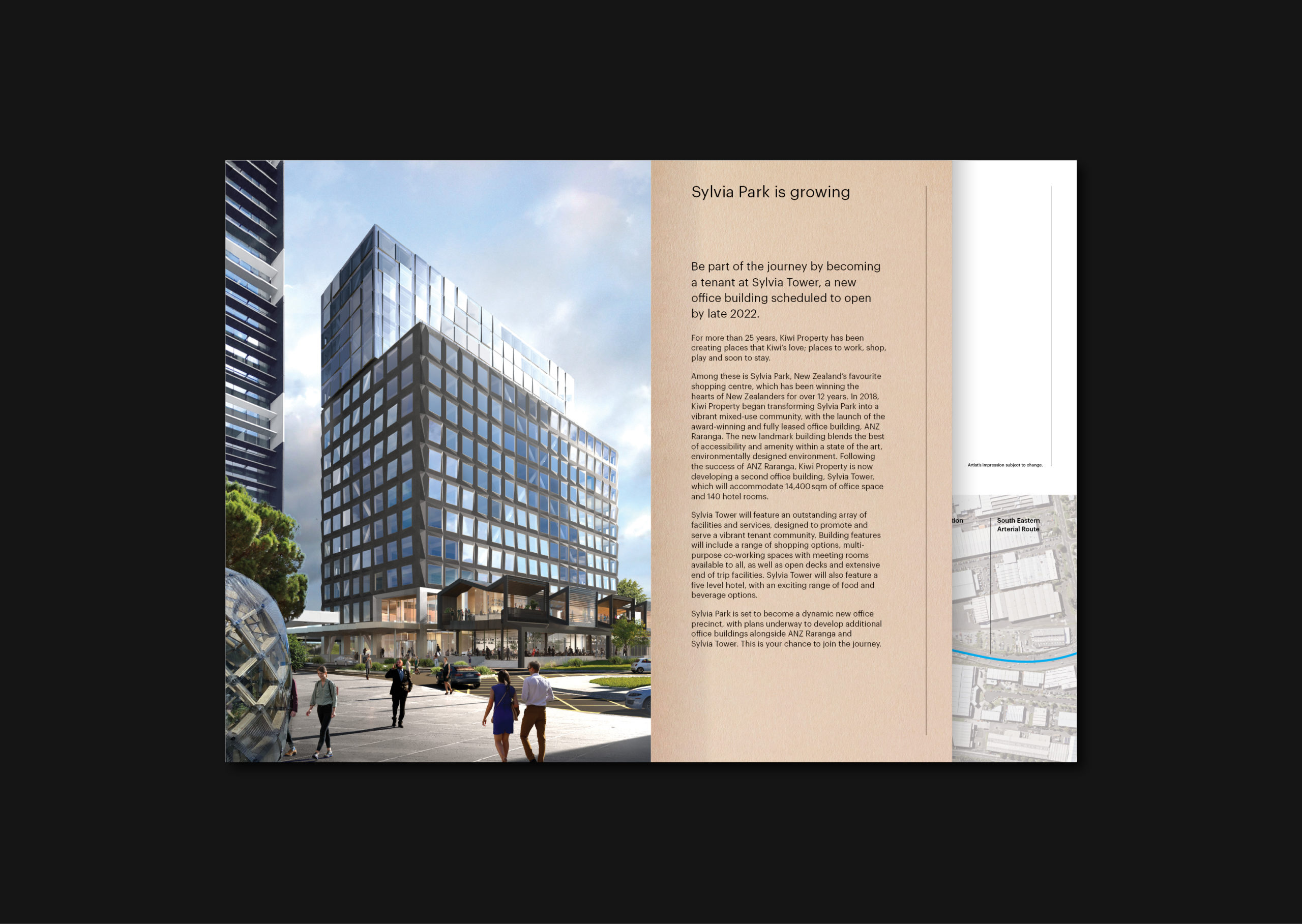
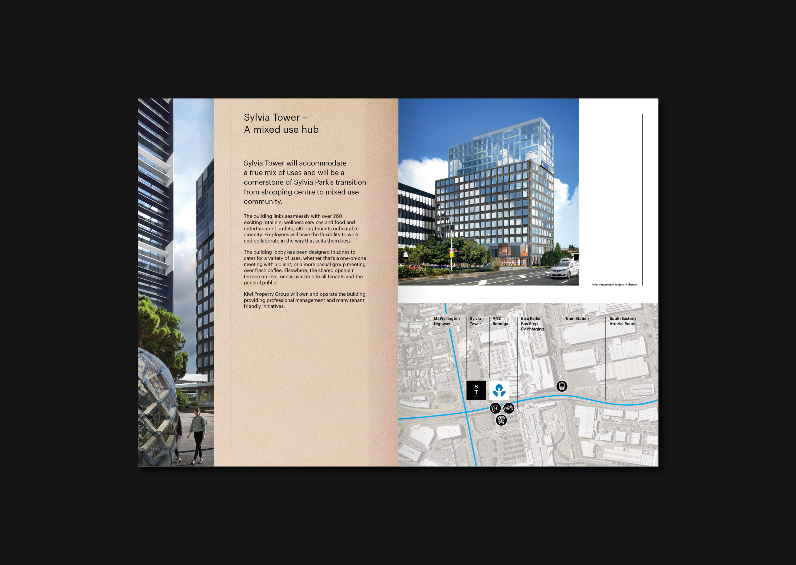
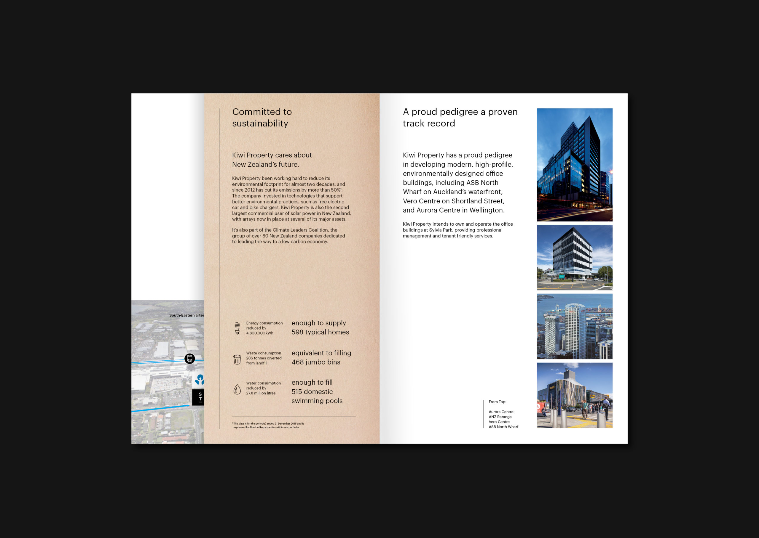
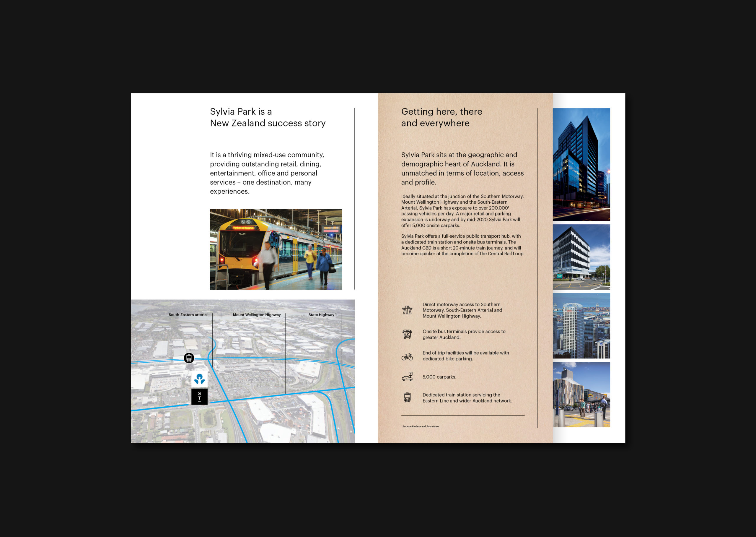
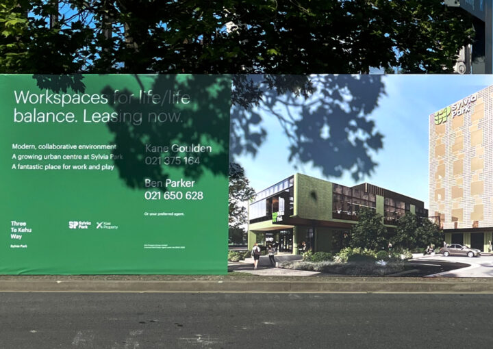
We’ve been working with Kiwi Property creating commercial property branding for their latest development, Sylvia Tower. This, their second commercial office building at Sylvia Park offers array of facilities and services, designed to promote and serve a vibrant tenant community. Building features will include a range of shopping options, multi-purpose co-working spaces and also feature a five level hotel, with a range of food and beverage options.

The architects Woods Bagot and Peddle Thorp’s vision for the building is that it is a navigational marker, or inhabited ‘lighthouse’ defining a significant place on the map.

The location of the building above a former stream of Maori significance is acknowledged in the façade, with subtle shifts in the colour and angle of the glazing referencing the shimmering reflections of water. These variations in glass and cladding forms then create reflections off the building that become scattered and dynamic.

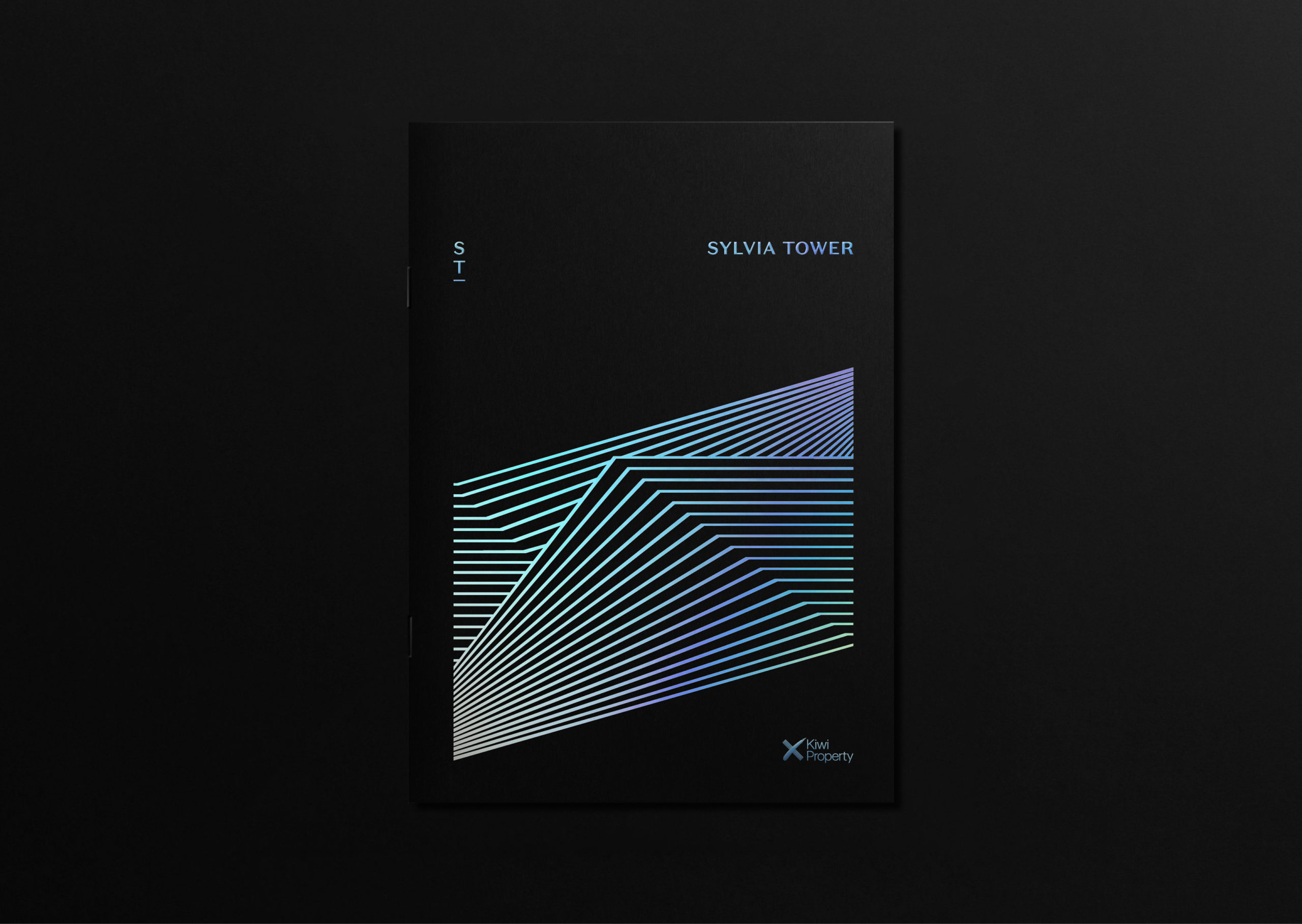
The architects’ vision helped inspire the brand components. We created a multi-planar linear mark to represent the building. In printed form this is rendered in a holographic foil which shimmers and catches the light, suggesting water.

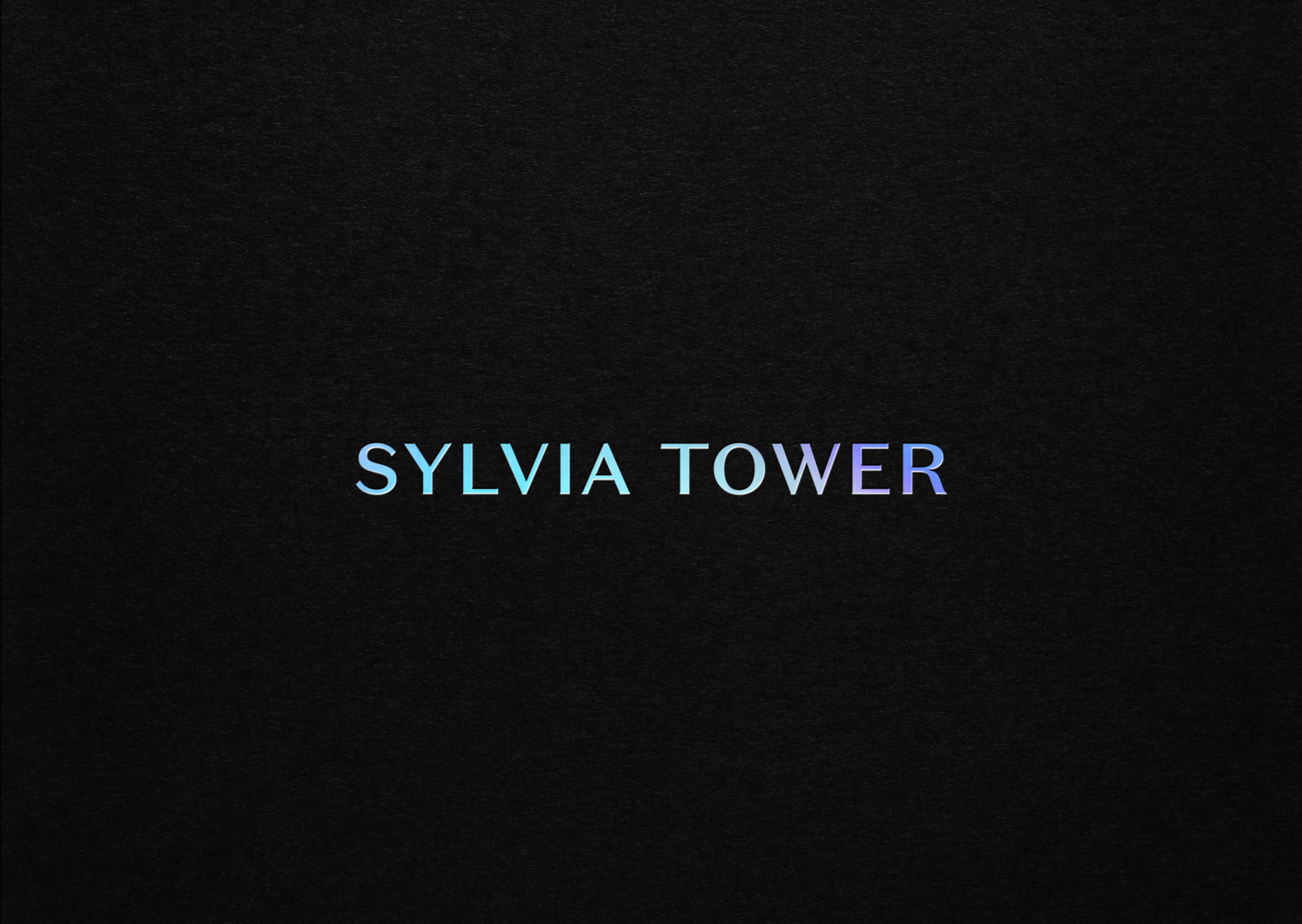
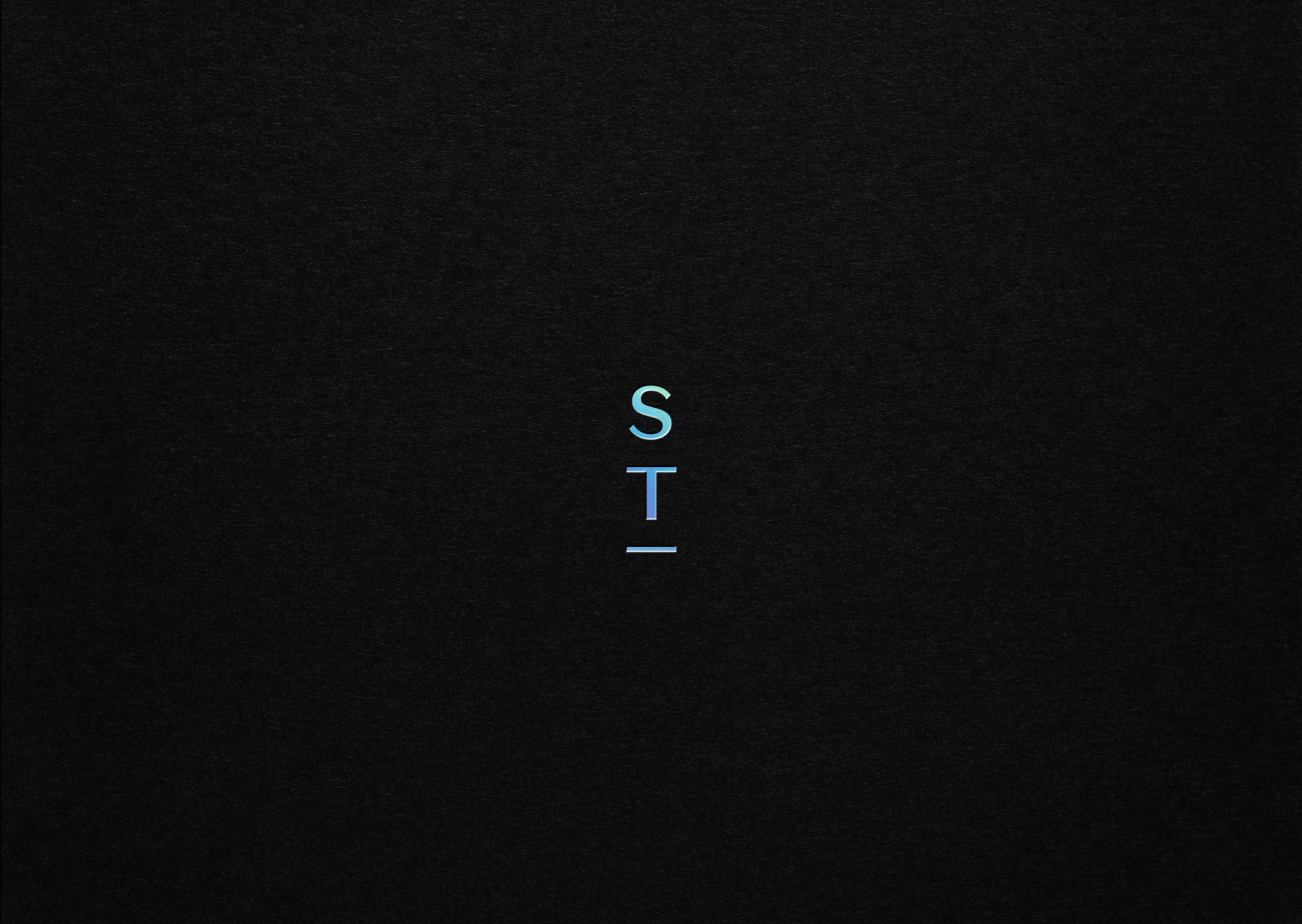
The Sylvia Tower wordmark is a contemporary balance of masculine and feminine, featuring subtle shifts in widths and form. An abbreviated ‘ST’ icon is vertically stacked to suggest the lighthouse beacon. The wordmark and icon are used in tandem; the icon acting as an anchor for information and defining space.

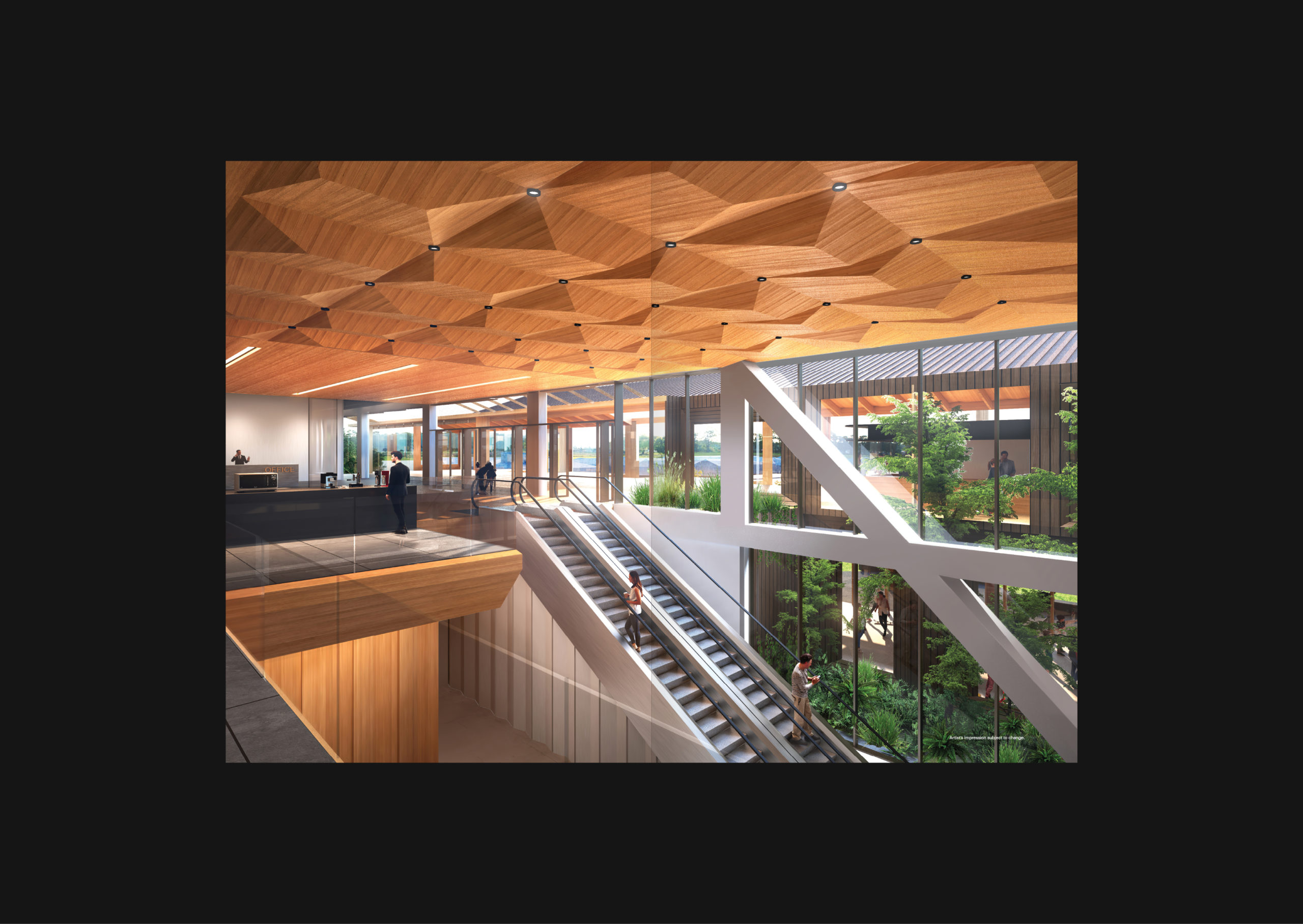
A monochrome colour palette is balanced with accents of natural tan and sand tones to echo the architectural interiors. A generous use of clear space in design communications support an identity system that feels refined and open. The clear typographic system creates an honest tone — creating an approachability that stays true to the architects’ concept for the commercial property.

Within the leasing brochure the two tier form is replicated with a literal change; short insert pages introduce and highlight the project intensions and uniqueness of location.

The result is commercial property branding that echoes the ethos of the building itself.

See more of our work with Kiwi Property land and commercial property branding here.

  • Category
  • Our work
Tags Brand, Print
Share this —
FacebookMessengerTwitterLinkedInPinterest
Recent Posts
  • Koh: a bold brand refresh
  • 3 Te Kehu Way Development Hoarding
  • 3 Te Kehu Way Development Hoardings
  • Retail Graphics – Sylvia Park Level 1 launch
  • 3 Te Kehu Way
Recent Comments
    Archives
    • January 2024
    • February 2022
    • January 2022
    • September 2021
    • July 2021
    • June 2021
    • January 2021
    • December 2020
    • August 2020
    • May 2020
    • March 2020
    • February 2020
    • January 2020
    • November 2019
    • August 2019
    • July 2019
    • June 2019
    • February 2019
    • December 2018
    • July 2018
    • June 2018
    • April 2018
    • February 2018
    • January 2018
    • November 2017
    • September 2017
    • August 2017
    • July 2017
    • June 2017
    • April 2017
    • March 2017
    • February 2017
    • January 2017
    • October 2016
    • August 2016
    • July 2016
    • May 2016
    • July 2015
    Categories
    • Our work
    • Soapbox
    Meta
    • Log in
    • Entries feed
    • Comments feed
    • WordPress.org
    Kiwi Property – Sylvia Tower branding their new commercial property development, Logo brand
    Kiwi Property – Sylvia Tower branding their new commercial property development, ST Logo Wordmark
    Kiwi Property – Sylvia Tower commercial development collateral brochure cover features a striking Holographic Foil
    Soap Design for Kiwi Property – Sylvia Tower branding their new commercial development, Holographic Foil Cover Brochure
    Kiwi Property – Sylvia Tower branding their new commercial development, Brochure
    Kiwi Property – Sylvia Tower branding their new commercial development, Brochure
    Kiwi Property – Sylvia Tower branding their new commercial development, Brochure
    Kiwi Property – Sylvia Tower branding their new commercial development, Brochure
    Kiwi Property – Sylvia Tower branding their new commercial development, Brochure
    Kiwi Property – Sylvia Tower branding their new commercial development, Brochure
    Kiwi Property – Sylvia Tower branding their new commercial development, Brochure
    Kiwi Property – Sylvia Tower branding their new commercial development, Brochure
    Koh: a bold brand refresh
    Koh Brand refresh emotive photography showing boy with mischievous expression with red hair in a light, bright, kitchen environment
    3 Te Kehu Way Development Hoardings
    3 Te Kehu Way Commercial Property Development Hoarding showing core marketing and leasing messaging featuring architectural render seen through dappled sunlight and tree branch shadows 3 Te Kehu Way Commercial Property Development Hoarding showing building image and messaging on green background
    Parker & Co. Eyewear brand development
    Parker and Co Branded Pocket – close up of blind emboss – white on white
    Back to Our work
    SOAP™

    Social

    • Instagram
    • Behance
    • Pinterest
    • LinkedIn

    Contact

    • +64 21 722 335
    • katie@soapdesign.co.nz

    Copyright

    • ©SOAPTM
    • All rights reserved
    • Terms and Conditions