SOAPTM
  • Work
  • Soapbox
  • About
  • Contact

Massons Commercial Property Law

  • Work
  • Soapbox
  • About
  • Contact

Partners Jodie Masson and Leisha de Aboitiz asked us to create an identity and visual language system for them as they prepared to move their team and establish a specialist commercial property law firm. Massons Commercial Property Law are now one of Australia’s leading boutique specialist commercial property law practices. We worked closely with Acumentum and Plot their Australia-based communication and development teams to deliver a comprehensive brand launch.

They wanted to launch the practice with a brand identity that reflected their expertise and professionalism and that would ensure stand out within their competitor landscape. After conducting a full visual audit of this landscape, we set about creating a unique visual positioning that speaks to Massons expertise and specialism in property.

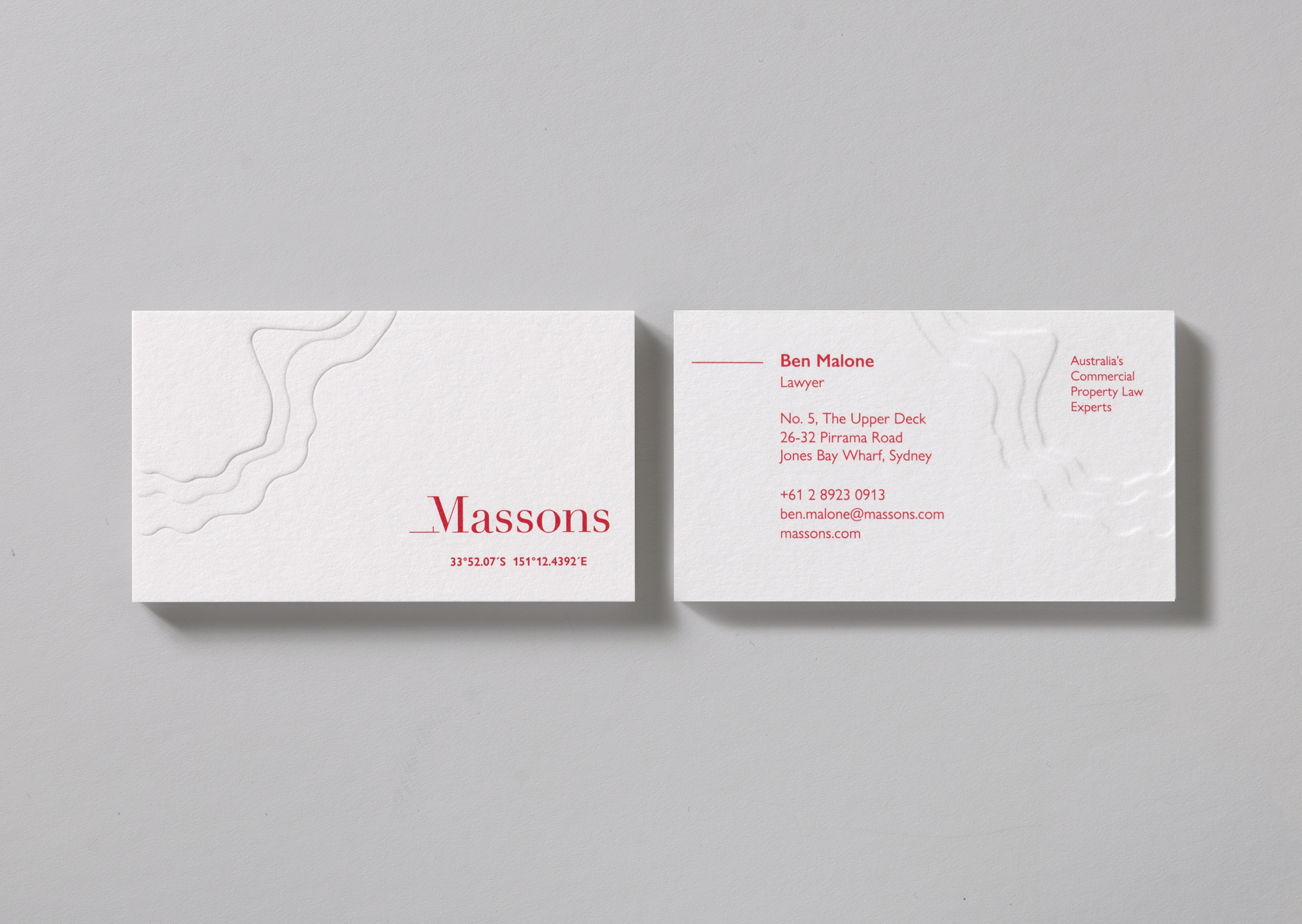
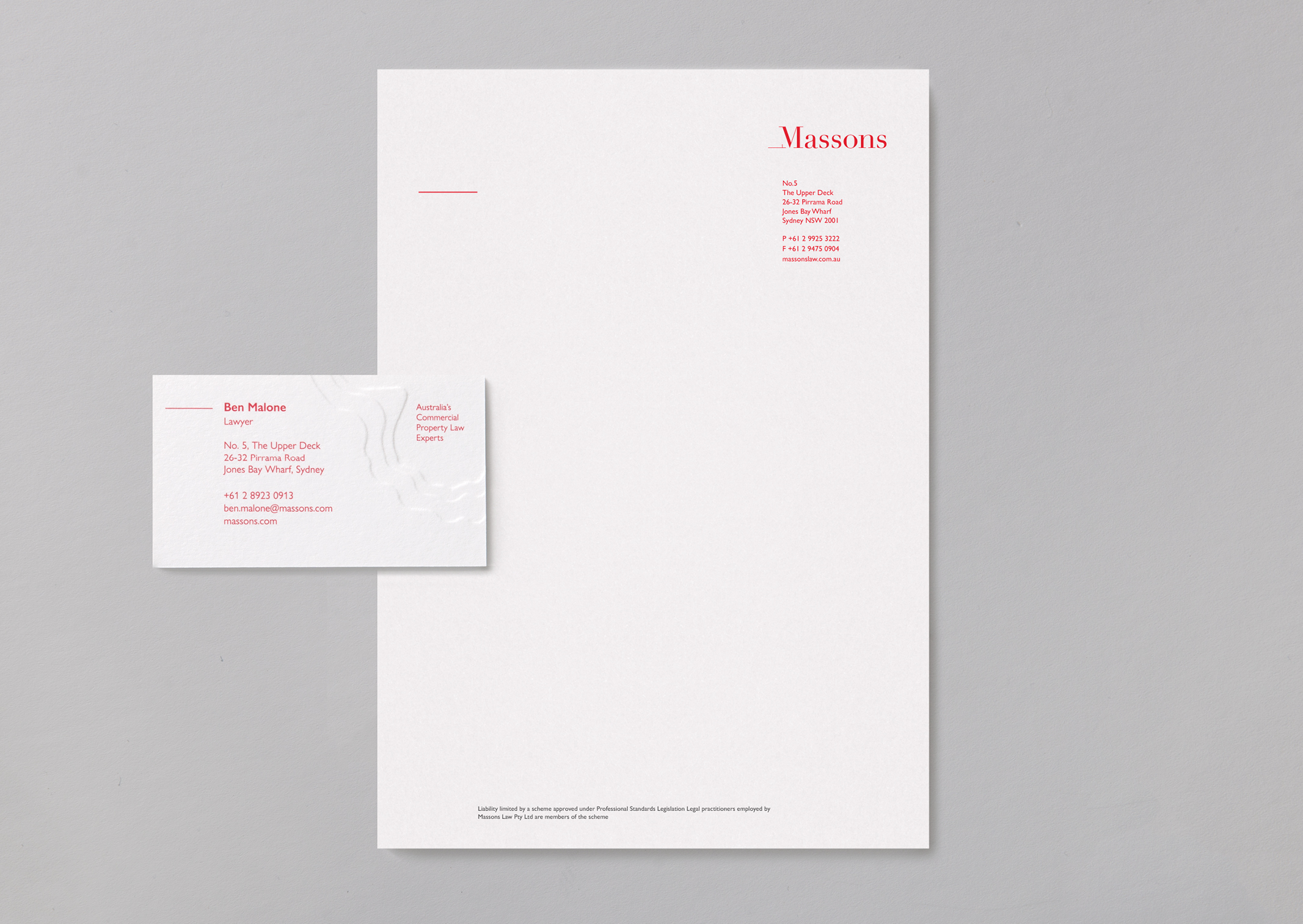
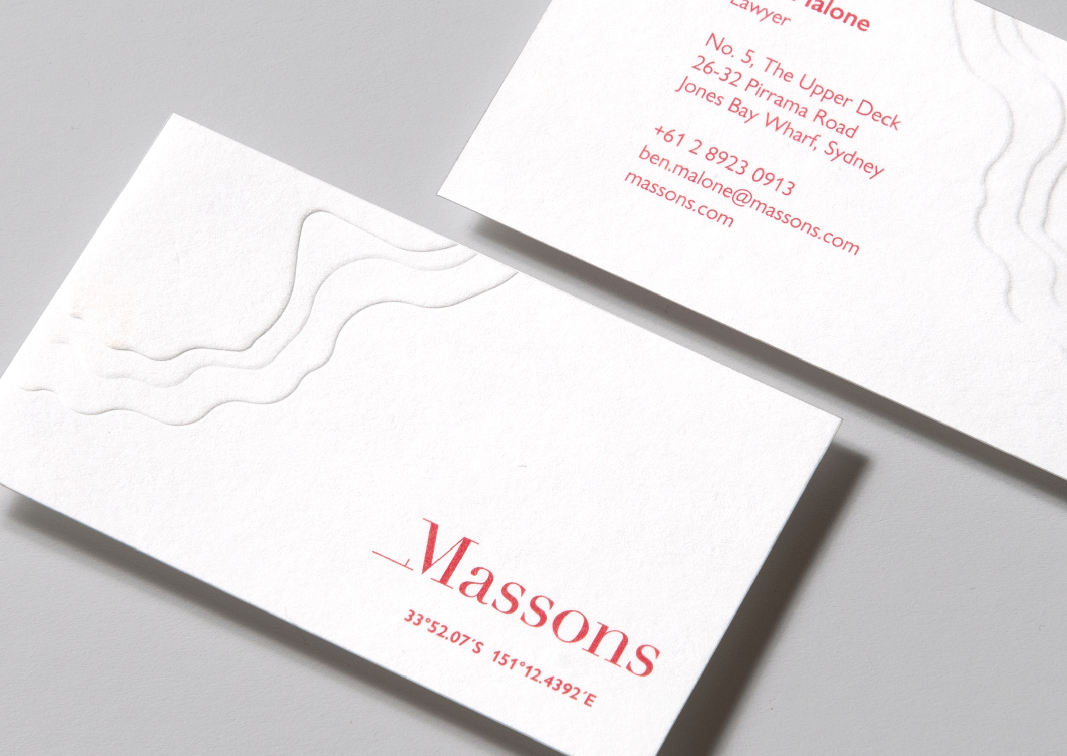
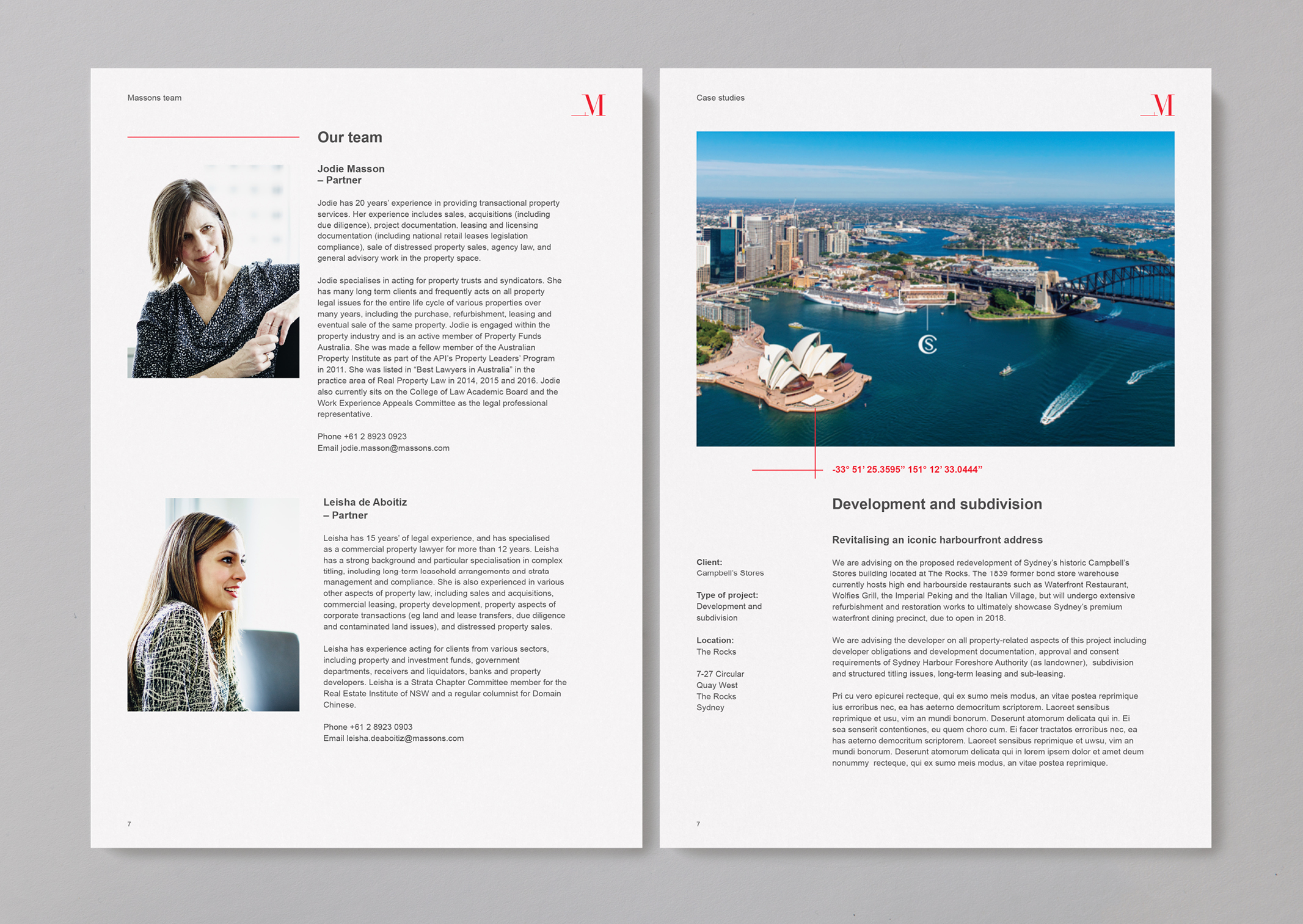
We based the identity around the distinctive identifier of each property or building that is at the core – it’s precise latitude and longitudinal coordinates. We combined Massons own Sydney latitude and longitude coordinates to form their identity with Massons wordmark – a clear serif typeface rendered in pure red.

We bought the wordmark and locational positioning to life further, as an animation that features on their website.

A Topographical linear pattern created depth to the visual narrative and is used on key touchpoints; business cards, environmental graphics and communication documents.

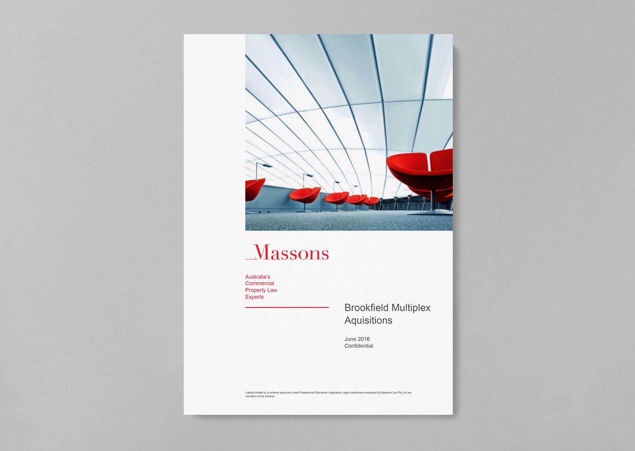
Across all digital and print touchpoints, the primary colour of Massons red is grounded with a timeless palette of neutrals.

We also delivered a photography style and system to deliver to the different communication requirements of Massons; primary imagery features premium property elements – which are textural and evoke a sense of sophistication and used within their own communications. To create modern and consistent feeling across photography featuring clients’ properties and places a treatment was developed.

Finally we directed a photoshoot to capture the collaborative nature and warmth of personalities within the Massons team to be used within both digital and print contexts.

  • Category
  • Our work
Tags Brand, Digital, Identity, Print
Share this —
FacebookMessengerTwitterLinkedInPinterest
Recent Posts
  • Koh: a bold brand refresh
  • 3 Te Kehu Way Development Hoarding
  • 3 Te Kehu Way Development Hoardings
  • Retail Graphics – Sylvia Park Level 1 launch
  • 3 Te Kehu Way
Recent Comments
    Archives
    • January 2024
    • February 2022
    • January 2022
    • September 2021
    • July 2021
    • June 2021
    • January 2021
    • December 2020
    • August 2020
    • May 2020
    • March 2020
    • February 2020
    • January 2020
    • November 2019
    • August 2019
    • July 2019
    • June 2019
    • February 2019
    • December 2018
    • July 2018
    • June 2018
    • April 2018
    • February 2018
    • January 2018
    • November 2017
    • September 2017
    • August 2017
    • July 2017
    • June 2017
    • April 2017
    • March 2017
    • February 2017
    • January 2017
    • October 2016
    • August 2016
    • July 2016
    • May 2016
    • July 2015
    Categories
    • Our work
    • Soapbox
    Meta
    • Log in
    • Entries feed
    • Comments feed
    • WordPress.org
    Massons Law business cards feature a deep topographic map emboss and location coordinates
    Massons business cards feature a deep topographic map emboss and matching letterhead
    Massons business cards feature a deep topographic map emboss and location coordinates
    Massons Property Law document cover template
    Massons Property Law document template spread featuring people and property
    Massons Law Candid Corporate People Portraits showing Partners
    Massons Law Candid Corporate People Portraits showing team
    Massons Law animated logo and location coordinates
    Koh: a bold brand refresh
    Koh Brand refresh emotive photography showing boy with mischievous expression with red hair in a light, bright, kitchen environment
    3 Te Kehu Way Development Hoardings
    3 Te Kehu Way Commercial Property Development Hoarding showing core marketing and leasing messaging featuring architectural render seen through dappled sunlight and tree branch shadows 3 Te Kehu Way Commercial Property Development Hoarding showing building image and messaging on green background
    Parker & Co. Eyewear brand development
    Parker and Co Branded Pocket – close up of blind emboss – white on white
    Back to Our work
    SOAP™

    Social

    • Instagram
    • Behance
    • Pinterest
    • LinkedIn

    Contact

    • +64 21 722 335
    • katie@soapdesign.co.nz

    Copyright

    • ©SOAPTM
    • All rights reserved
    • Terms and Conditions