SOAPTM
  • Work
  • Soapbox
  • About
  • Contact

Keith & Sandy – Custom Residential

  • Work
  • Soapbox
  • About
  • Contact

Custom Residential is a boutique real estate agency with a focus on individuality and service. Keith and Sandy Dowdle are both owners and also consultants within the agency. Whilst no longer the ‘new kids on the block’, Keith and Sandy’s own approach has developed to one of guidance: calm, intelligent and offering a wealth of expertise.

Keith and Sandy engaged us to articulate their unique approach and establish differentiation in the marketplace; to stay relevant to existing/previous clients as well as create a clear ‘brand story’ to attract new clients.

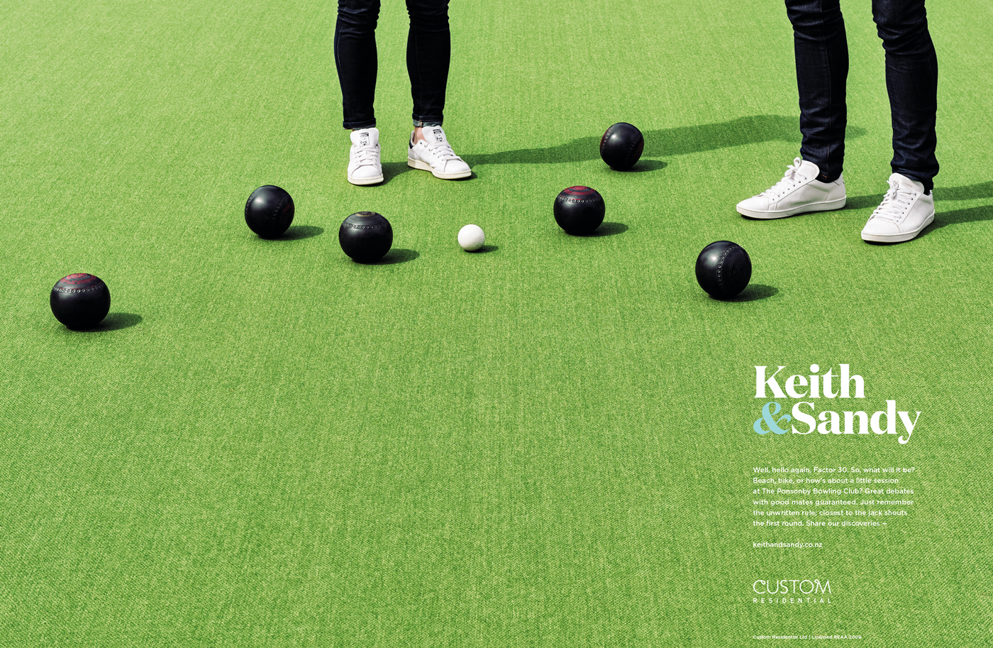
“It’s not about selling the house it’s about the emotional engagement with the area and the lifestyle it offers. The house is just the context for this. Our branding and visual language needed to absolutely reinforce that connection”.

We began by conducting qualitative research to understand the decision making drivers across key customer scenarios and this analysis informed our approach.

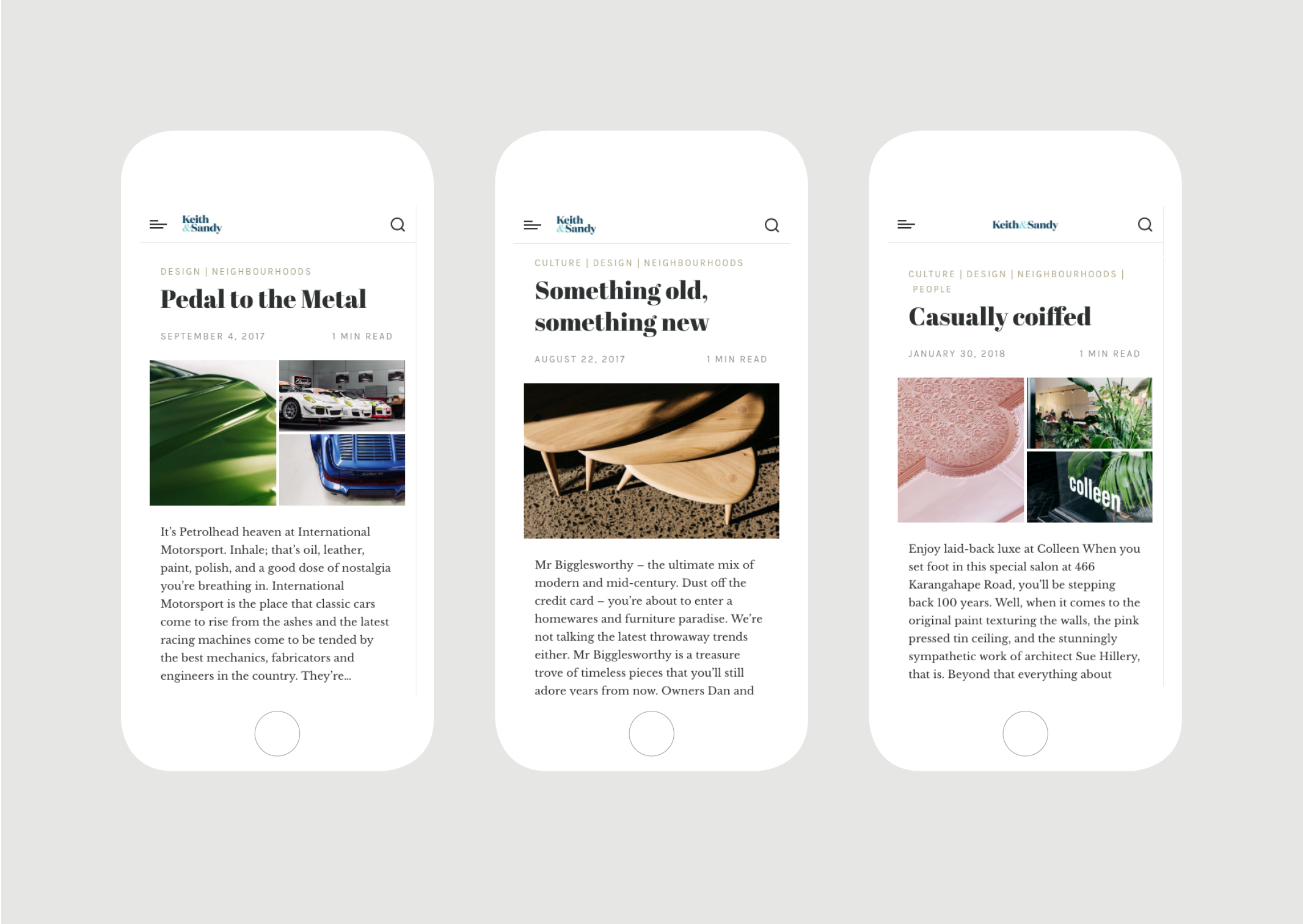
We created a ‘Keith&Sandy’ identity to reflect their engaging characters and strong team approach and developed a visual language which is individual but works harmoniously with the overarching Custom Brand. The photographic style provides a distinct perspective; visually restrained images make a bold statement with just a whisper, creating real standout in a noisy space. This is delivered with a tone of voice that is intelligent, real and a bit playful – just like them.

“A mark of our success is being recognised as the go-to for advice and guidance around property, not just buy and sell; we have seen a real lift in this and a comfort in people seeking us out since the launch of the campaign”.

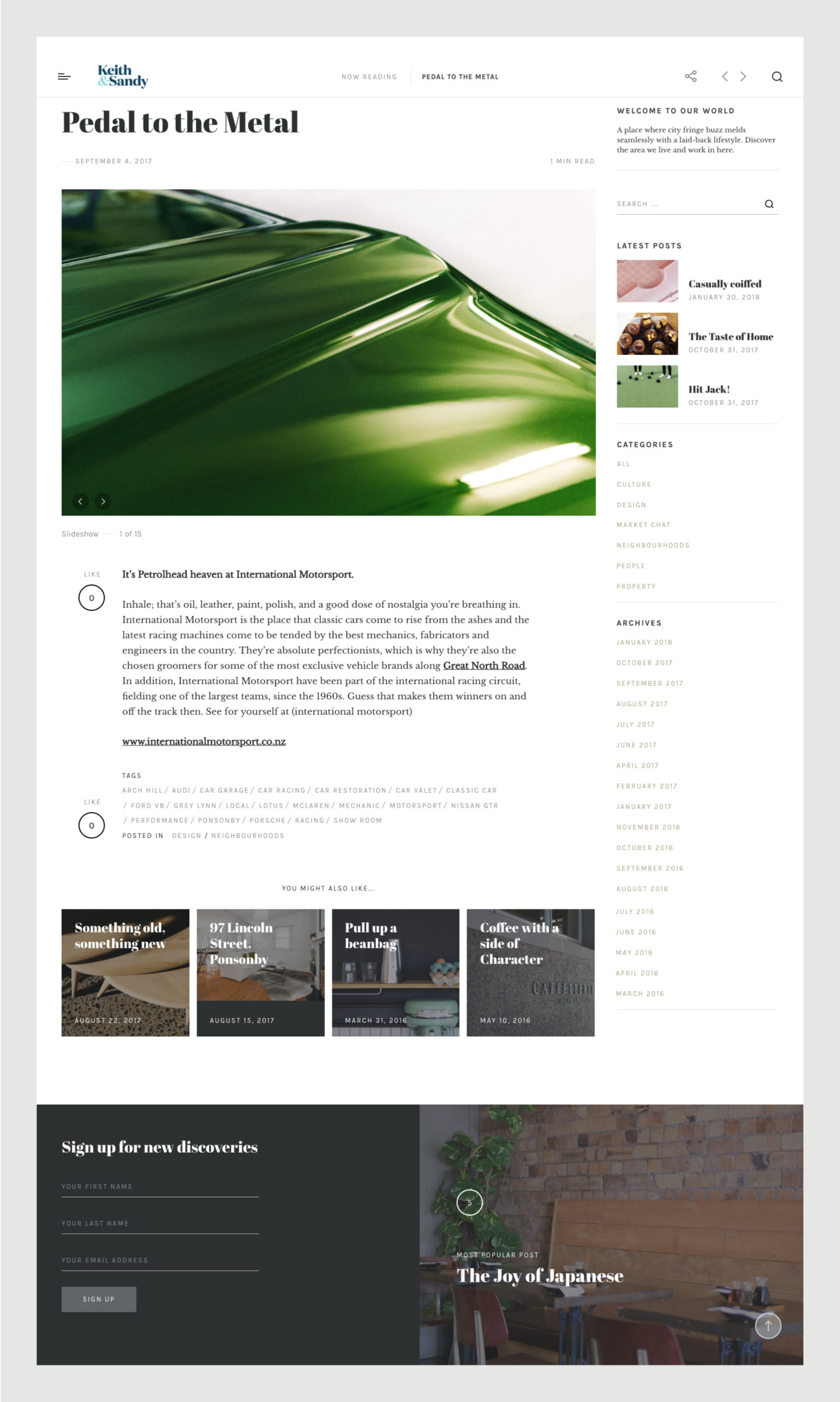
These brand components have been brought to life consistently across channels, spearheaded with a print advertising campaign and blog. Each ad heroes features of the neighbourhood that make it such a unique and desirable place to call home. Readers are encouraged to visit their blog for more of Keith and Sandy’s unique take on the hood – celebrating local hidden gems and some of their favourite haunts.

The new brand, campaign and blog have translated to some exciting results for Keith & Sandy.

“2016 has been one of the most profitable years of the company in one of the tightest listing markets the local area has seen”

“For us there has been a real synergy in engaging another local start-up – SOAP™ and working with an agency who really understands what’s required to make our offering so unique”.

  • Category
  • Our work
Tags Brand, Copy, Digital, Print
Share this —
FacebookMessengerTwitterLinkedInPinterest
Recent Posts
  • Koh: a bold brand refresh
  • 3 Te Kehu Way Development Hoarding
  • 3 Te Kehu Way Development Hoardings
  • Retail Graphics – Sylvia Park Level 1 launch
  • 3 Te Kehu Way
Recent Comments
    Archives
    • January 2024
    • February 2022
    • January 2022
    • September 2021
    • July 2021
    • June 2021
    • January 2021
    • December 2020
    • August 2020
    • May 2020
    • March 2020
    • February 2020
    • January 2020
    • November 2019
    • August 2019
    • July 2019
    • June 2019
    • February 2019
    • December 2018
    • July 2018
    • June 2018
    • April 2018
    • February 2018
    • January 2018
    • November 2017
    • September 2017
    • August 2017
    • July 2017
    • June 2017
    • April 2017
    • March 2017
    • February 2017
    • January 2017
    • October 2016
    • August 2016
    • July 2016
    • May 2016
    • July 2015
    Categories
    • Our work
    • Soapbox
    Meta
    • Log in
    • Entries feed
    • Comments feed
    • WordPress.org
    Keith and Sandy Custom Residential bespoke team identity
    Keith and Sandy branding – Denizen – designer trainers and bowling balls on expansive bowling green
    Keith and Sandy branding – dramatic close up of warm toned wooden table and chair
    Keith and Sandy branding – low angle view of boardwalk and sea
    Keith and Sandy branding – dramatic view of skate park
    Website blog featuring emerald green close up of car bonnet
    Website blog featuring dramatically lit pool tables
    Website blog featuring dramatic close up of yellow ball on green baize of pool tables
    series of mobile views of Website blog showing articles and modern photography
    Koh: a bold brand refresh
    Koh Brand refresh emotive photography showing boy with mischievous expression with red hair in a light, bright, kitchen environment
    3 Te Kehu Way Development Hoardings
    3 Te Kehu Way Commercial Property Development Hoarding showing core marketing and leasing messaging featuring architectural render seen through dappled sunlight and tree branch shadows 3 Te Kehu Way Commercial Property Development Hoarding showing building image and messaging on green background
    Parker & Co. Eyewear brand development
    Parker and Co Branded Pocket – close up of blind emboss – white on white
    Back to Our work
    SOAP™

    Social

    • Instagram
    • Behance
    • Pinterest
    • LinkedIn

    Contact

    • +64 21 722 335
    • katie@soapdesign.co.nz

    Copyright

    • ©SOAPTM
    • All rights reserved
    • Terms and Conditions