SOAPTM
  • Work
  • Soapbox
  • About
  • Contact

Humphreys Landscaping architect’s brochure

  • Work
  • Soapbox
  • About
  • Contact

We helped high-end urban landscapers Humphreys tend to their business by creating a brochure that enabled Architects to introduce Humphreys’ services as part of an overall design solution for their clients.

When Architects are your primary audience you have to produce something that’s well considered, beautifully designed, and engaging. This brochure also needed to impress their often high spending clientele.

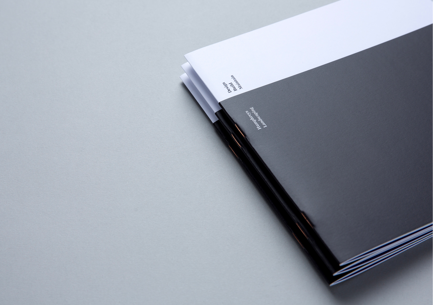
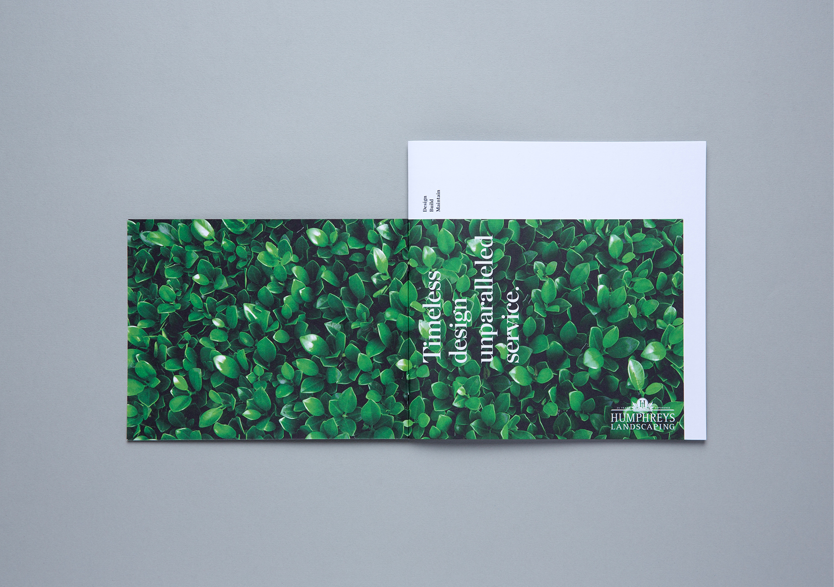
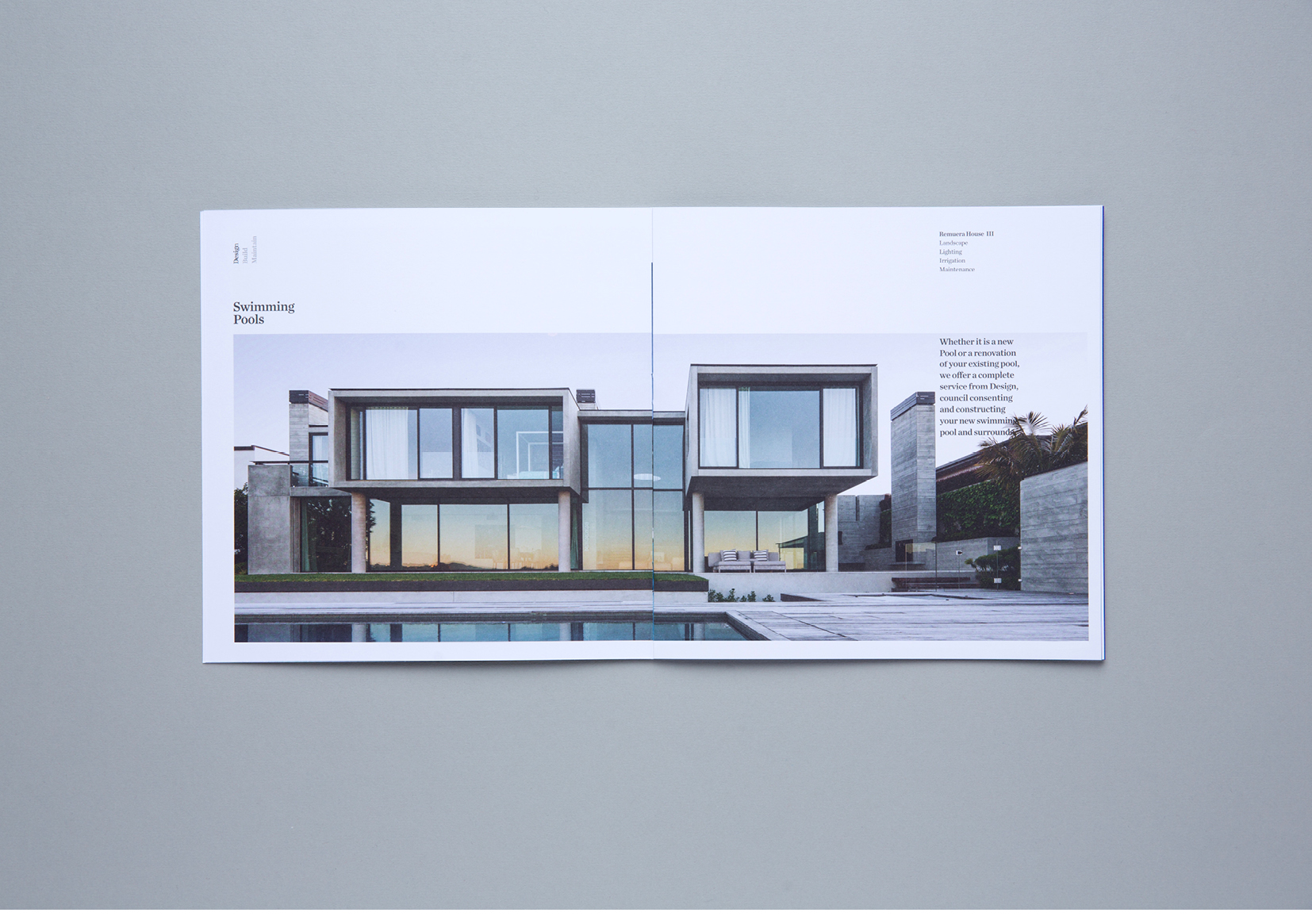
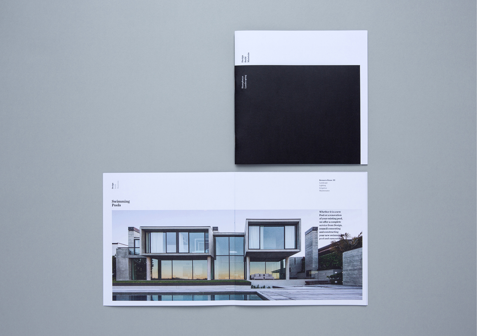
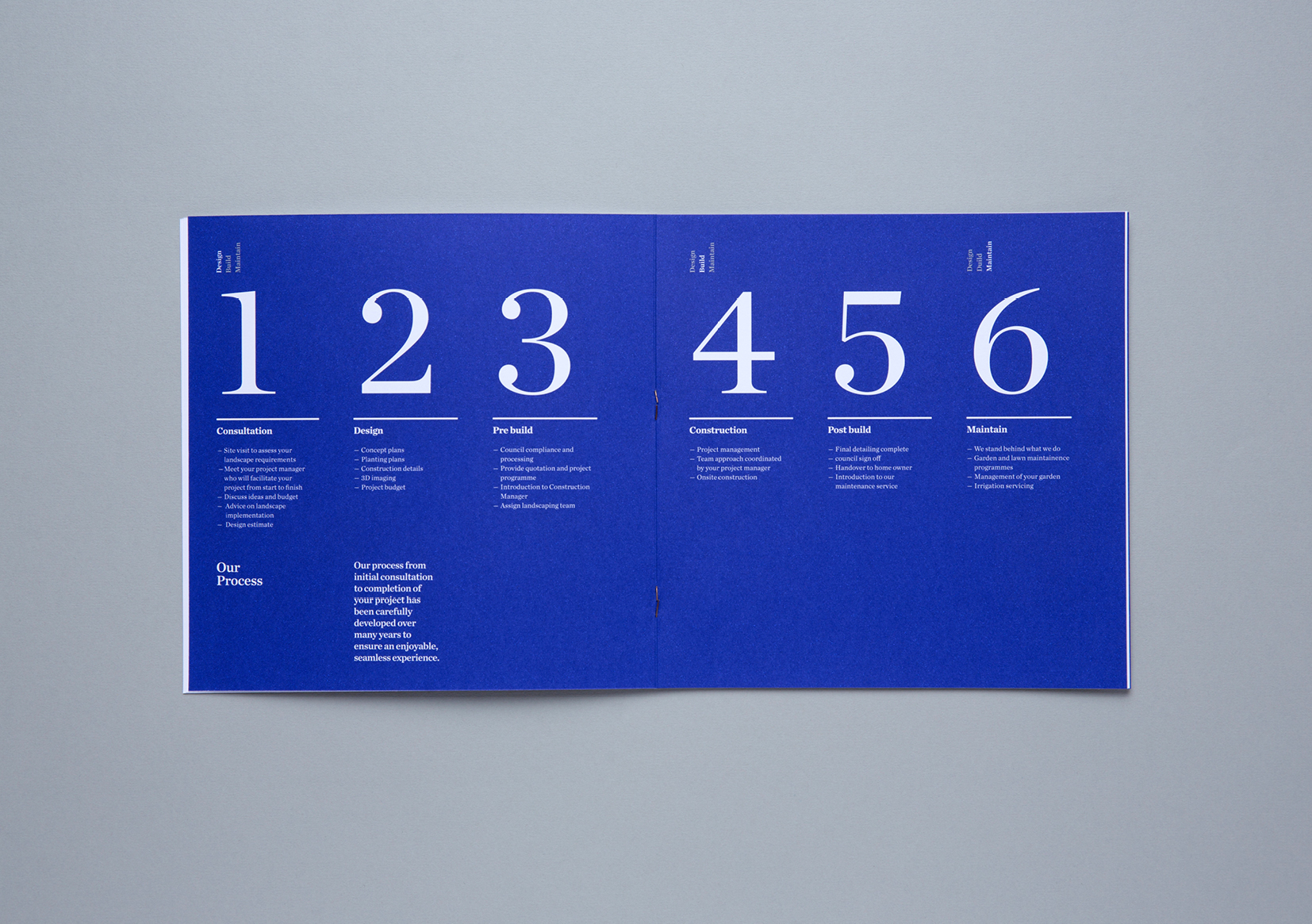
Firstly, we helped Humphreys establish their ‘Timeless design, unparalleled service’ positioning. We then streamlined their business descriptor into three key offerings – Design/Build/Maintain. These were used as a navigation system throughout the brochure. Each section featured a selection of case studies, including a list of services to help build instant credibility with both the architect and client.

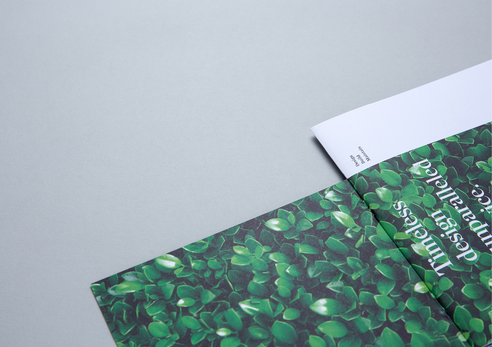
When it came to inspiration we took ours from nature, albeit Humphrey’s stylishly manicured version of the great outdoors. To create a sense of intrigue, we made readers feel like they were peeking over a luxurious hedge, to look around Humphrey’s work.

For the client the brochure showcased aspirational landscaping solutions alongside information detailing the pragmatic and functional services Humphreys have to offer. Whereas Architects needed to be reassured that Humphreys would deliver a sympathetic high quality landscaping solution to marry with their architectural concept.

Black, white and minimal design spoke to Humphrey’s timeless quality. Contrasted against lush foliage, revealed via shorter cut covers, this ‘hedging’ wrapped around the brochure, just as it would the boundaries of a property. Hidden behind the hedge were a number of surprise reveals including large shots of premium gardens.

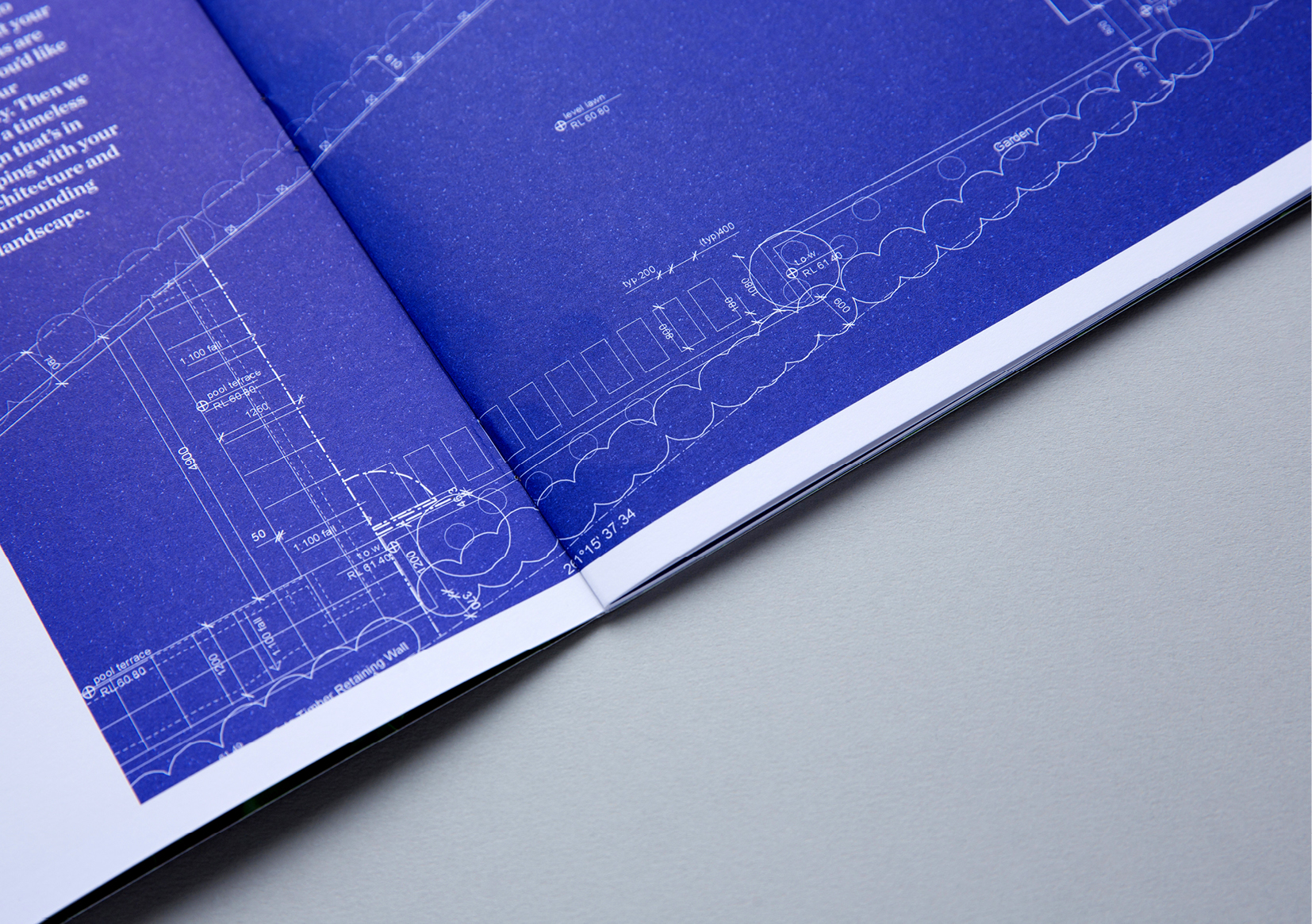
Little touches, such as incorporating cobalt blue as a nod to the blueprint stage of the landscaping design process, a client list inside the back cover, and bronze staples for binding, all added the overall luxury of a brochure that truly reflected their premium business.

View our work on the Humphreys Landscaping website.

  • Category
  • Our work
Tags Copy, Identity, Print
Share this —
FacebookMessengerTwitterLinkedInPinterest
Recent Posts
  • Koh: a bold brand refresh
  • 3 Te Kehu Way Development Hoarding
  • 3 Te Kehu Way Development Hoardings
  • Retail Graphics – Sylvia Park Level 1 launch
  • 3 Te Kehu Way
Recent Comments
    Archives
    • January 2024
    • February 2022
    • January 2022
    • September 2021
    • July 2021
    • June 2021
    • January 2021
    • December 2020
    • August 2020
    • May 2020
    • March 2020
    • February 2020
    • January 2020
    • November 2019
    • August 2019
    • July 2019
    • June 2019
    • February 2019
    • December 2018
    • July 2018
    • June 2018
    • April 2018
    • February 2018
    • January 2018
    • November 2017
    • September 2017
    • August 2017
    • July 2017
    • June 2017
    • April 2017
    • March 2017
    • February 2017
    • January 2017
    • October 2016
    • August 2016
    • July 2016
    • May 2016
    • July 2015
    Categories
    • Our work
    • Soapbox
    Meta
    • Log in
    • Entries feed
    • Comments feed
    • WordPress.org
    Humphreys Landscaping Brochure – stack of black and white covers
    Humphreys Landscaping Brochure – spread showing open front cover featuring lush hedge
    Humphreys Landscaping Brochure – close up view of inside front cover showing lush hedge
    Humphreys Landscaping Brochure – spread showing dramatic modernist home and garden
    Humphreys Landscaping Brochure – black and white cover and spread showing modernist home and garden
    Humphreys Landscaping Brochure – close up view of design blueprint
    Humphreys Landscaping Brochure – numbered engagement process simply explained
    Koh: a bold brand refresh
    Koh Brand refresh emotive photography showing boy with mischievous expression with red hair in a light, bright, kitchen environment
    Parker & Co. Eyewear brand development
    Parker and Co Branded Pocket – close up of blind emboss – white on white
    Carbon Method CrossFit branding
    Carbon Method CrossFit Logo Wordmark Branding Identity Weight lifting
    Back to Our work
    SOAP™

    Social

    • Instagram
    • Behance
    • Pinterest
    • LinkedIn

    Contact

    • +64 21 722 335
    • katie@soapdesign.co.nz

    Copyright

    • ©SOAPTM
    • All rights reserved
    • Terms and Conditions