SOAPTM
  • Work
  • Soapbox
  • About
  • Contact

Helmut Salon identity and website

  • Work
  • Soapbox
  • About
  • Contact

“If Coco Chanel had a love a child with Alexander McQueen and Nirvana, that’s us”. Is this not the best one-line brief for creating a brand? Hèlmut, an emerging Auckland-based hair salon expressed this in our initial briefing for creating their brand and website.

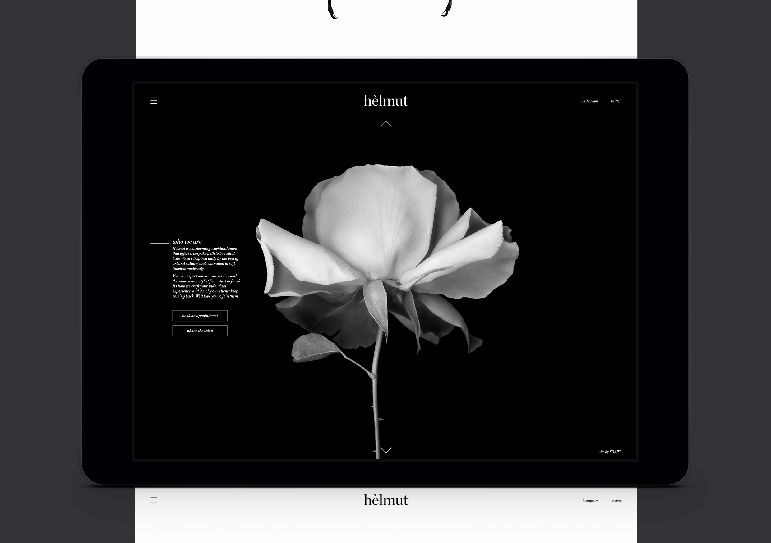
As a salon they driven by individual style; inspired daily by art and culture, providing a truly bespoke approach, only employing senior stylists who provide clients with a crafted, one-to-one service from start to finish.

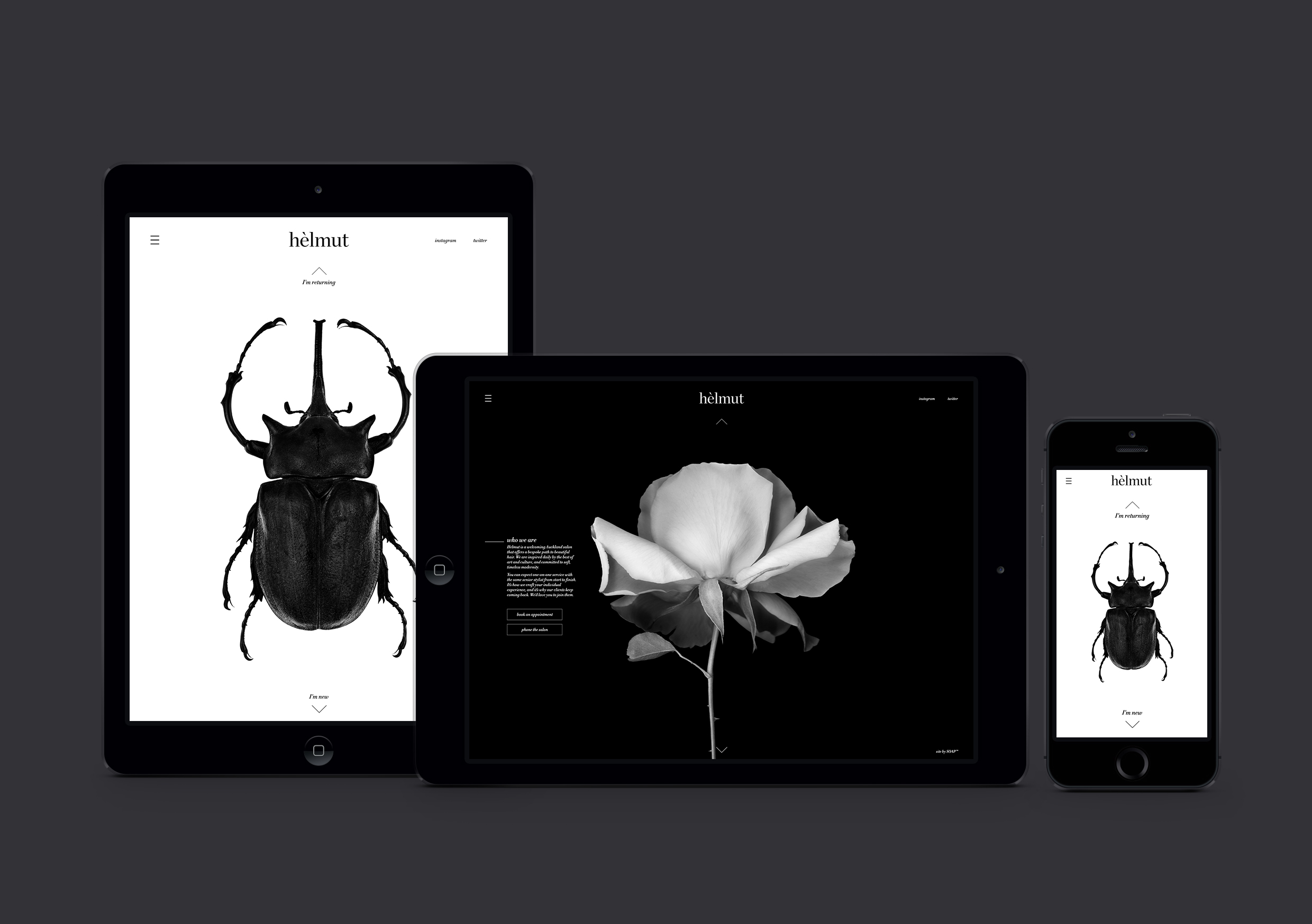
The identity reflects the kind of timeless beauty that Hèlmut is known for creating for their clients; the smallest details are never overlooked and the curvaceous flick of the grave, like a strand of hair, references this.

The brand imagery is both provocative and sophisticated, an illustration of how beauty may be discovered in different forms; challenging our perceptions, reframing our view points. Hèlmut’s aesthetic was designed to embody it’s brand attributes: timeless, elegant and assured. Both photography and typography are expressed via a simple black and white colour palette – a nod to the salon’s namesake, photographer Helmut Newton. 

The unique experience delivered by Hèlmut was key to our creative approach in designing the website.

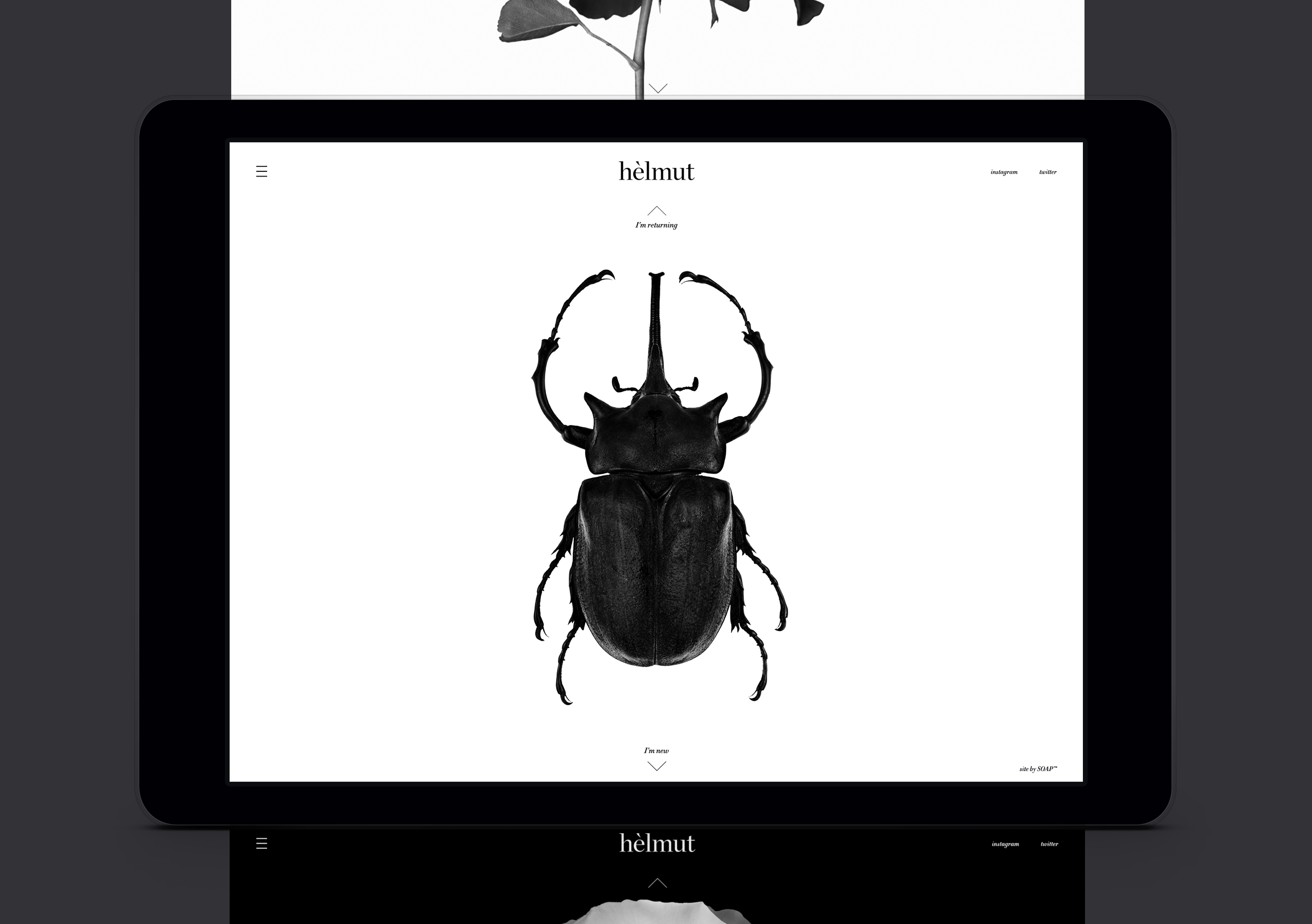
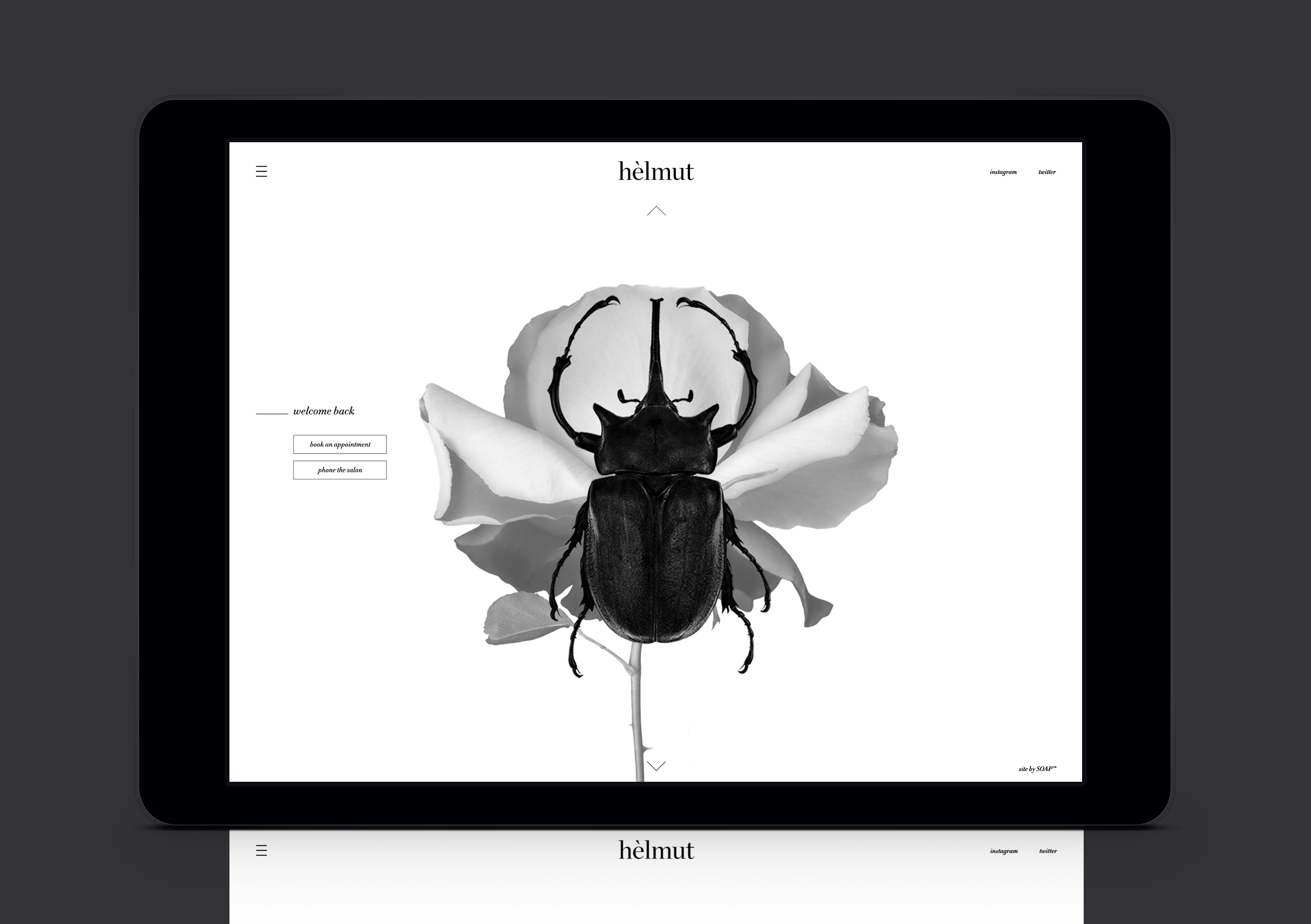
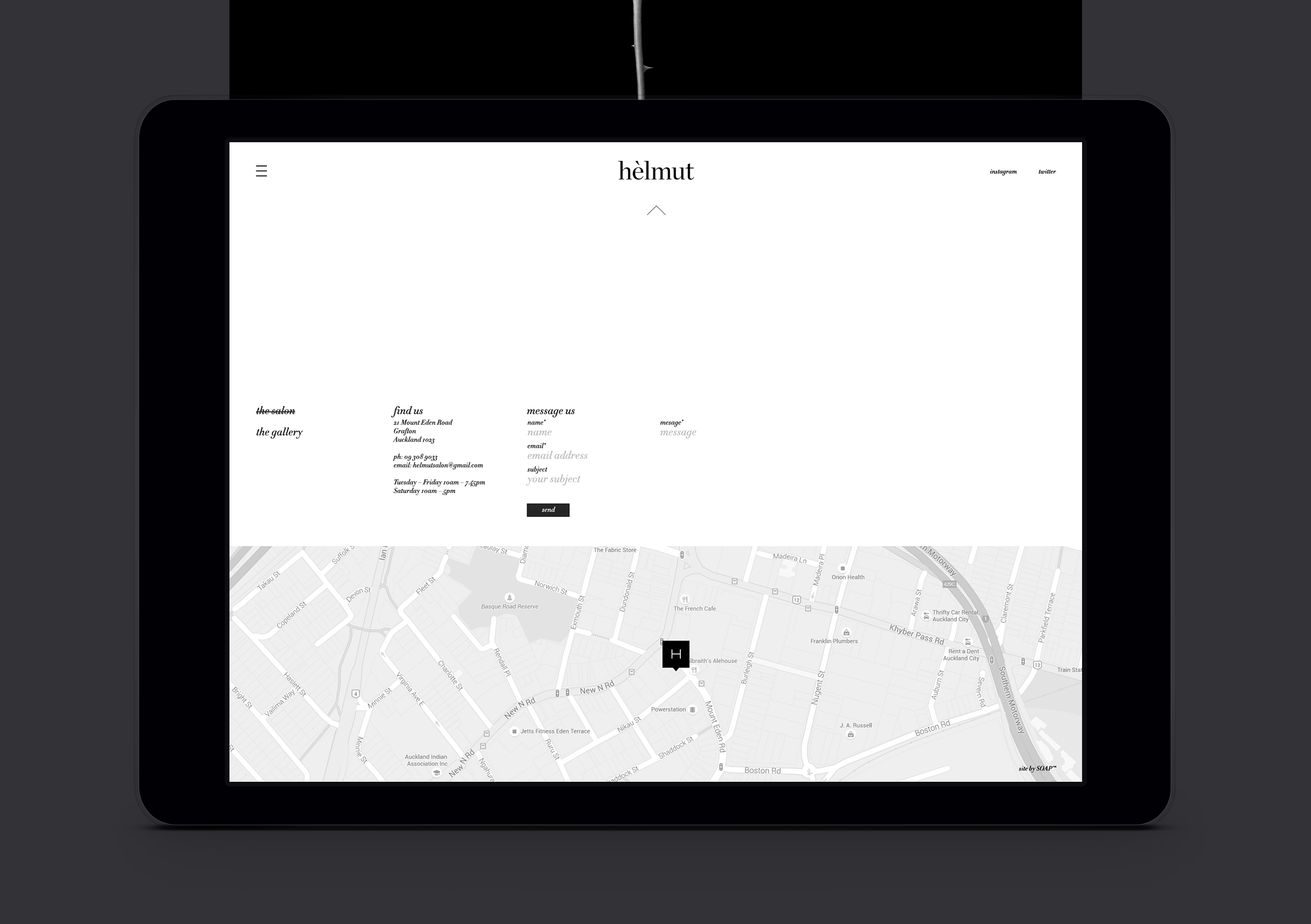
Recognising the different information new clients prefer compared to existing clientele, user journeys are offered from the homepage tailored to their needs. Client behaviour is recognised in the offering of options; new clients are introduced to Hèlmut and the experience they can expect on becoming a client, whilst existing clients are welcomed back – both are given the option to use a streamlined online booking system or to phone the salon directly for appointments.

This tailored approach is amplified further with a carefully considered responsive site, catering to peoples’ interaction on their selected device.

  • Category
  • Our work
Tags Brand, Digital, Identity
Share this —
FacebookMessengerTwitterLinkedInPinterest
Recent Posts
  • Koh: a bold brand refresh
  • 3 Te Kehu Way Development Hoarding
  • 3 Te Kehu Way Development Hoardings
  • Retail Graphics – Sylvia Park Level 1 launch
  • 3 Te Kehu Way
Recent Comments
    Archives
    • January 2024
    • February 2022
    • January 2022
    • September 2021
    • July 2021
    • June 2021
    • January 2021
    • December 2020
    • August 2020
    • May 2020
    • March 2020
    • February 2020
    • January 2020
    • November 2019
    • August 2019
    • July 2019
    • June 2019
    • February 2019
    • December 2018
    • July 2018
    • June 2018
    • April 2018
    • February 2018
    • January 2018
    • November 2017
    • September 2017
    • August 2017
    • July 2017
    • June 2017
    • April 2017
    • March 2017
    • February 2017
    • January 2017
    • October 2016
    • August 2016
    • July 2016
    • May 2016
    • July 2015
    Categories
    • Our work
    • Soapbox
    Meta
    • Log in
    • Entries feed
    • Comments feed
    • WordPress.org
    Helmut Salon – white on black elegant identity with accent flick
    Helmut Salon website homepage showing dark scarab beetle on white background
    Helmut Salon website new customer screen showing rose on black background
    Helmut Salon website returning customer screen showing scarab beetle and rose overlaid
    Helmut Salon website contact page showing map and elegant type
    Helmut Salon website home and booking pages on multiple devices
    Koh: a bold brand refresh
    Koh Brand refresh emotive photography showing boy with mischievous expression with red hair in a light, bright, kitchen environment
    3 Te Kehu Way Development Hoardings
    3 Te Kehu Way Commercial Property Development Hoarding showing core marketing and leasing messaging featuring architectural render seen through dappled sunlight and tree branch shadows 3 Te Kehu Way Commercial Property Development Hoarding showing building image and messaging on green background
    Parker & Co. Eyewear brand development
    Parker and Co Branded Pocket – close up of blind emboss – white on white
    Back to Our work
    SOAP™

    Social

    • Instagram
    • Behance
    • Pinterest
    • LinkedIn

    Contact

    • +64 21 722 335
    • katie@soapdesign.co.nz

    Copyright

    • ©SOAPTM
    • All rights reserved
    • Terms and Conditions