SOAPTM
  • Work
  • Soapbox
  • About
  • Contact

Daikin Australia

  • Work
  • Soapbox
  • About
  • Contact

The air conditioning market was presented to us as a visual landscape cluttered with all brands speaking with similar voices solely focused on features and product benefits. Research revealed that although leading technical innovation, Daikin wasn’t differentiated in this crowded space and needed to break free.

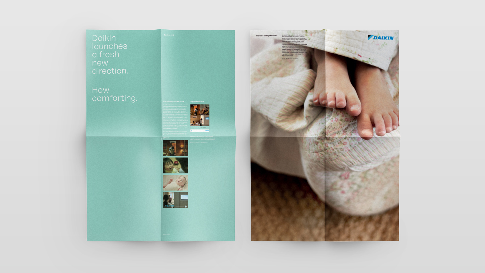
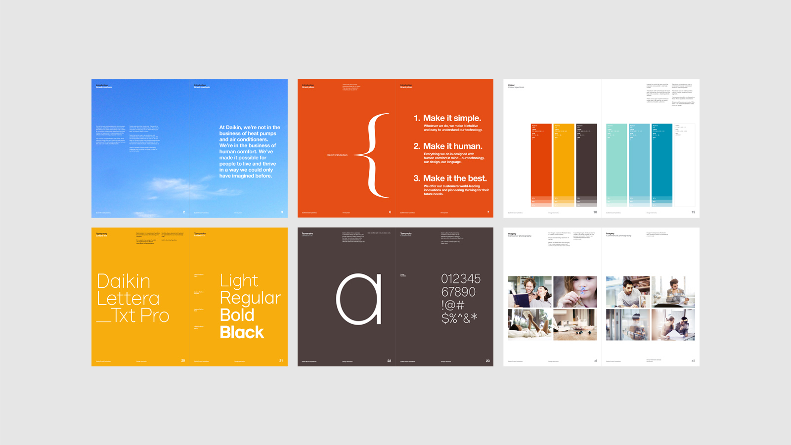
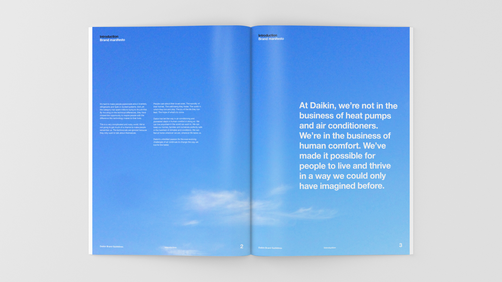
The task, ‘Create clear air between Daikin and the competition through Design’. With this challenge we took an approach underpinned with three core principles: Be simple. Be human. Be the best. Following the theme of the TVC, we set about redefining the brand toolkit, moving Daikin to tell an emotional story of connecting people beyond just technology.

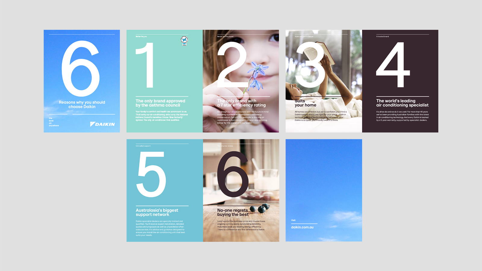
The direction for imagery was taken to reveal intimate moments as the key focal-point to our photographic style. We set about creating a sense of emotion with the product itself enabling the consumer to be able to visualise an aspirational experience similar to the moment we create. The imagery was directed to be textured, real and products present without feeling center staged or formulaic. When looking to feature the ‘rational’, we created a clean and sophisticated style without losing the intimacy. For the heroic product shots we helped Daikin reveal their design seamlessly blending into any space.

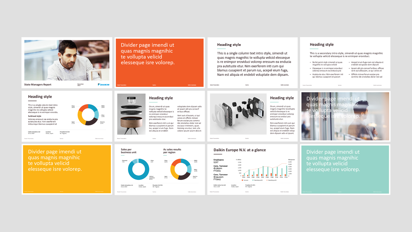
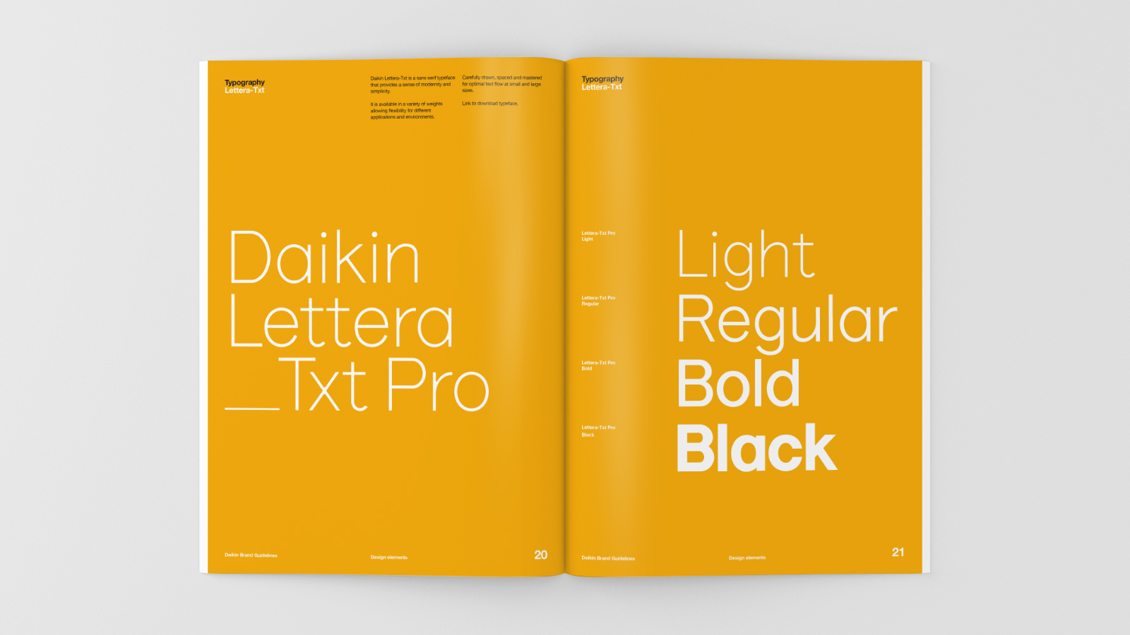
Typographically we simplified and humanised Daikin’s approach, selecting a single typeface that was both modern and fresh whilst staying hard working to function well at large display and small copy sizes. This was important in order to work across multiple channels.  The tone of voice was also clarified, moving away from technical jargon to relate to the customer – conversational and informative.

A flexibile colour palette was also introduced; we created a harmonious spectrum of both warm and cool colours – easily combined with each other or used alone.

The final solution has helped create clear differentiation within this functional category, allowing Daikin to establish a real sense of warmth and connection with their customers.

  • Category
  • Our work
Tags Brand, Digital, Print
Share this —
FacebookMessengerTwitterLinkedInPinterest
Recent Posts
  • Koh: a bold brand refresh
  • 3 Te Kehu Way Development Hoarding
  • 3 Te Kehu Way Development Hoardings
  • Retail Graphics – Sylvia Park Level 1 launch
  • 3 Te Kehu Way
Recent Comments
    Archives
    • January 2024
    • February 2022
    • January 2022
    • September 2021
    • July 2021
    • June 2021
    • January 2021
    • December 2020
    • August 2020
    • May 2020
    • March 2020
    • February 2020
    • January 2020
    • November 2019
    • August 2019
    • July 2019
    • June 2019
    • February 2019
    • December 2018
    • July 2018
    • June 2018
    • April 2018
    • February 2018
    • January 2018
    • November 2017
    • September 2017
    • August 2017
    • July 2017
    • June 2017
    • April 2017
    • March 2017
    • February 2017
    • January 2017
    • October 2016
    • August 2016
    • July 2016
    • May 2016
    • July 2015
    Categories
    • Our work
    • Soapbox
    Meta
    • Log in
    • Entries feed
    • Comments feed
    • WordPress.org
    Daikin – Trade Presenter for TVC – features stills on aqua background from new colour palette and emotive imagery
    Daikin Powerpoint Templates – features fresh colour palette, new brand imagery and typography
    Daikin – 6 Reasons Why Brochure – features fresh, nature-inspired colour palette and emotive imagery
    Daikin brand guidelines – multiple spreads showing colour, typography and photography
    Daikin brand guidelines – new brand typeface examples
    Daikin brand guidelines – introduction set against a clear sky
    Koh: a bold brand refresh
    Koh Brand refresh emotive photography showing boy with mischievous expression with red hair in a light, bright, kitchen environment
    3 Te Kehu Way Development Hoardings
    3 Te Kehu Way Commercial Property Development Hoarding showing core marketing and leasing messaging featuring architectural render seen through dappled sunlight and tree branch shadows 3 Te Kehu Way Commercial Property Development Hoarding showing building image and messaging on green background
    Parker & Co. Eyewear brand development
    Parker and Co Branded Pocket – close up of blind emboss – white on white
    Back to Our work
    SOAP™

    Social

    • Instagram
    • Behance
    • Pinterest
    • LinkedIn

    Contact

    • +64 21 722 335
    • katie@soapdesign.co.nz

    Copyright

    • ©SOAPTM
    • All rights reserved
    • Terms and Conditions