Barrie Connor is an interior designer with a New York pedigree. His boutique practice deals with both the residential and commercial sectors and he required a brand identity and business cards which could demonstrate what he stands for and appeal to this broad audience.
He asked us to create an identity that is representative of him as a designer and to embody his design aesthetic – a luxurious, classic style with a modern twist.
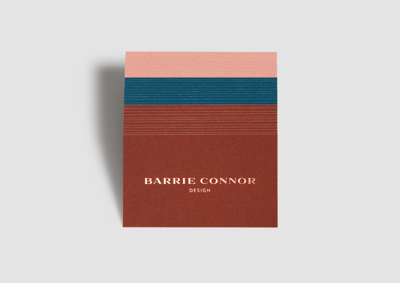
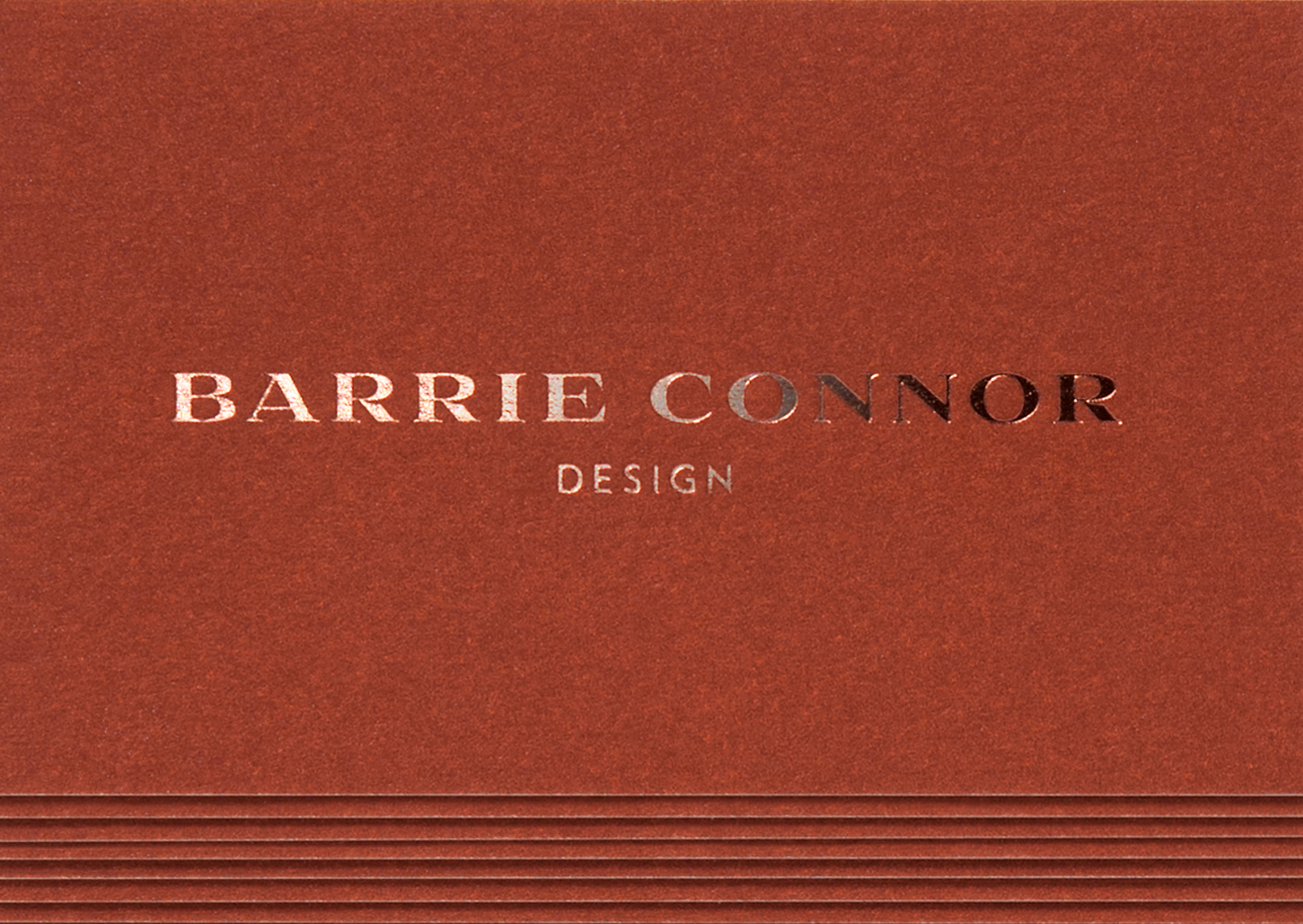
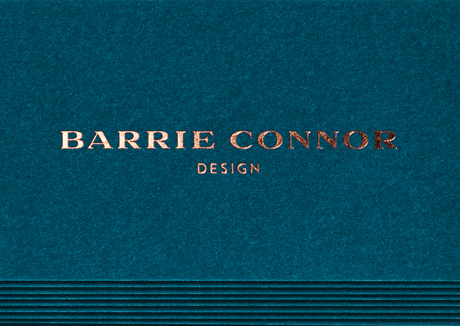
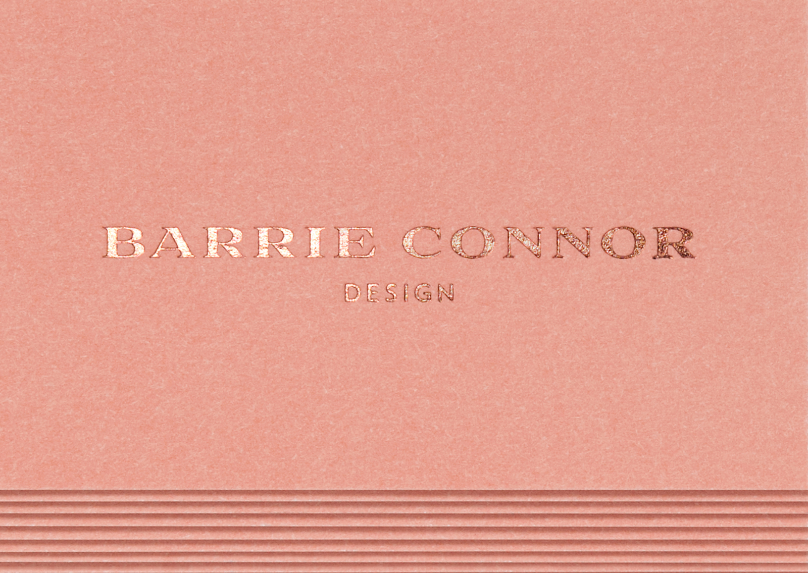
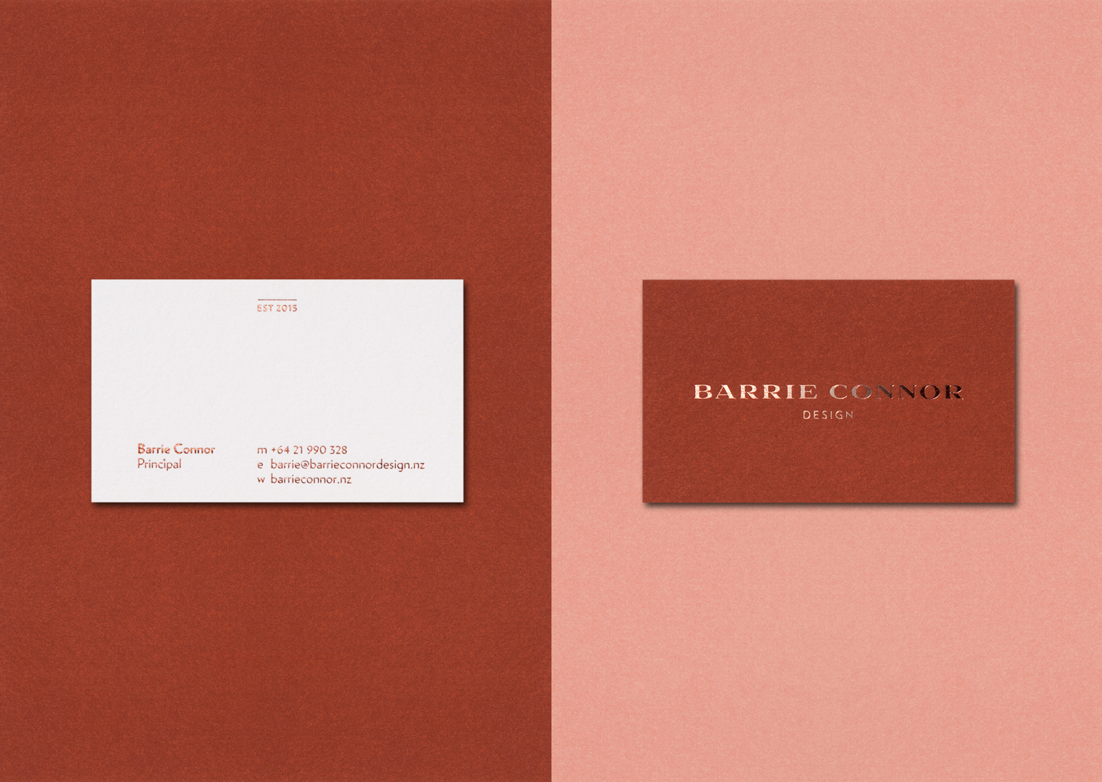
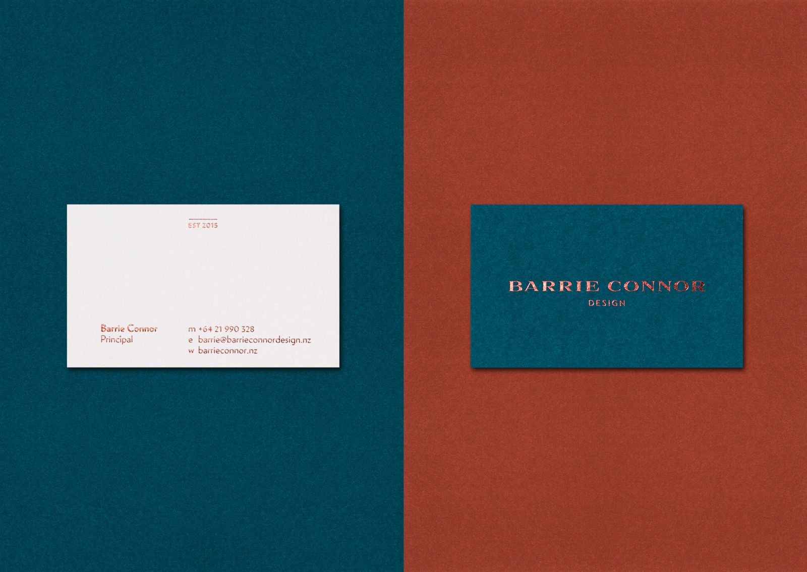
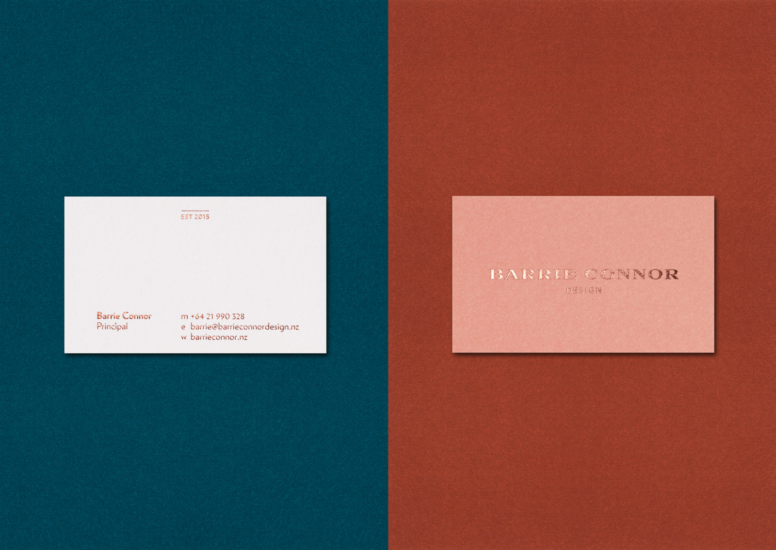
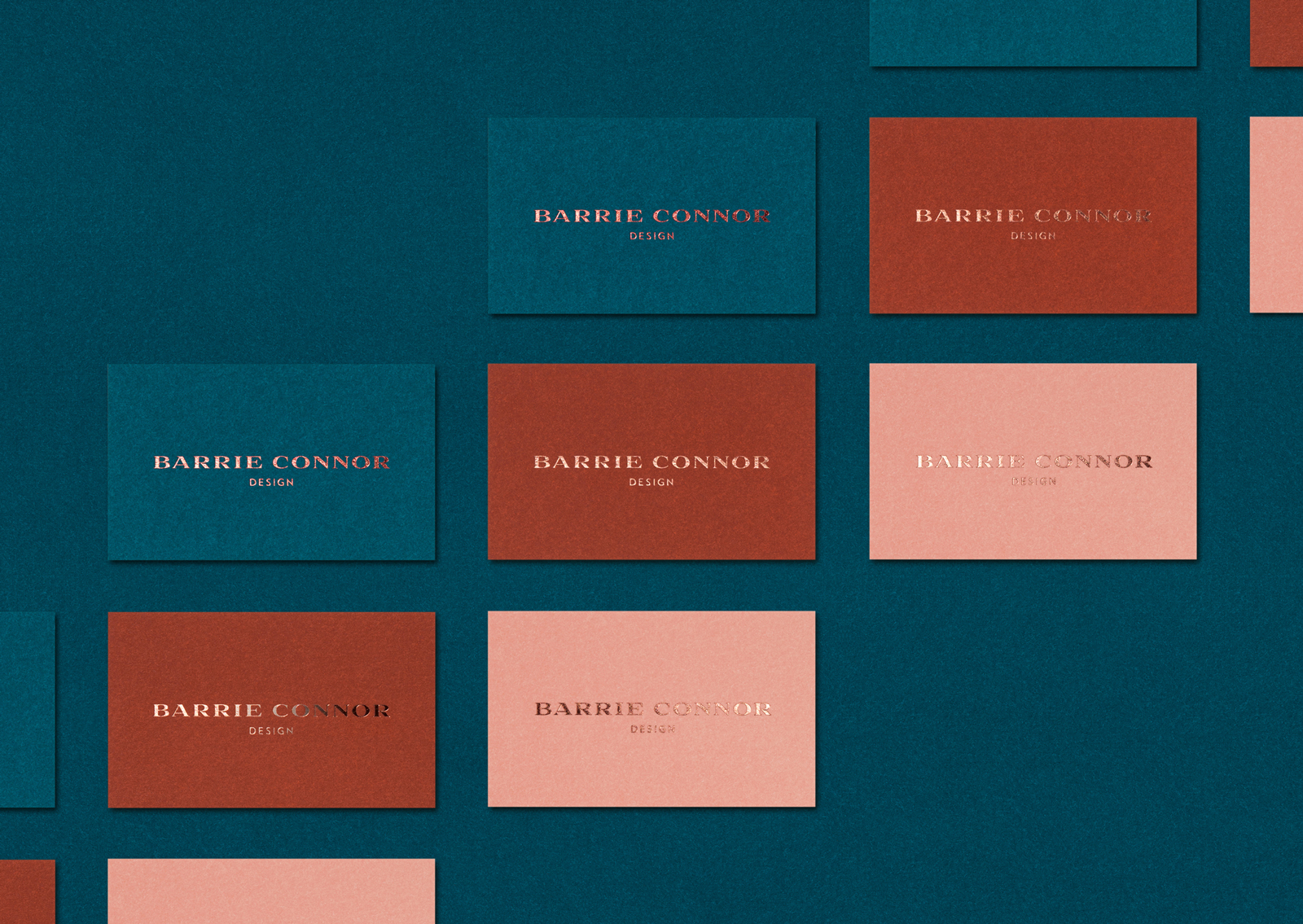
Our chosen direction had three bespoke colours to make up a unique set of swatches. The individual colours (Blush, Delft Blue, Rich Tan) were inspired by those found in classic interiors but now combined in a fresh and complementary way.
These colours were not available as standard Pantone colours so were mixed especially with our printer to create the specific hues we were looking for – and something truly unique to Barrie. This refinement of each hue meant the colours could be adjusted to marry together perfectly. Printing on to uncoated cotton board allowed the colour to come to life and form part of tactile material not unexpected from fabric swatches used by an interior designer.
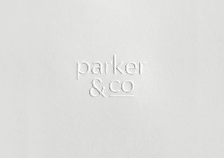
Complementing these real and rich colours we printed the logotype in rose copper foil; the foiling and intricate detailing in the logotype imply a high level of craftsmanship and a subtle emboss adds to the refinement.
The copper foil continues on the contrasting white reverse of the card and features an established date 2015 – a subtle nod to the traditional which is contrasted with a clean, elegant sans serif typographic treatment.
The final solution allows Barrie to select an appropriate colour/card for each client that he meets, with the three colours working harmoniously together – and independently. This act is a small gesture in context of a designer meeting a client for the first time, but helps to set the tone for a collaborative process between designer and client.