SOAP™ Design Branding. Superfluous nothing. Our brand lives the ethos we apply to our clients’ work – pare back to the core message to communicate clearly, effectively – and purposefully.
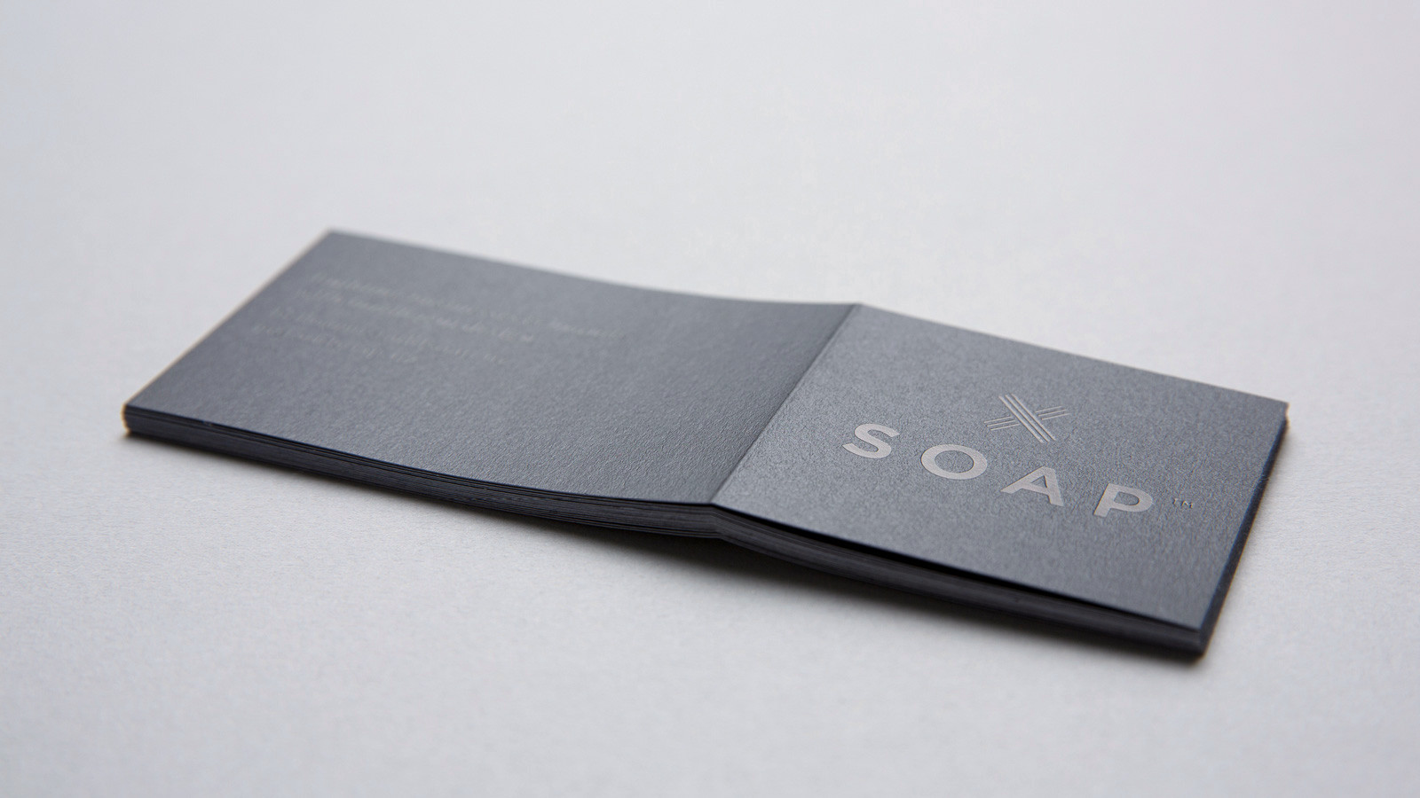
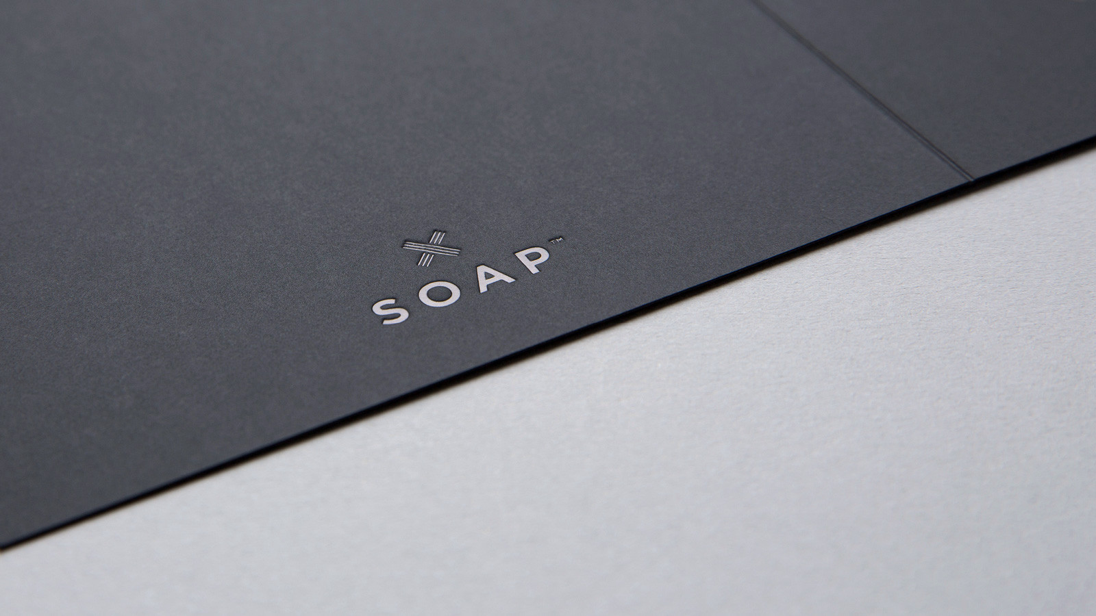
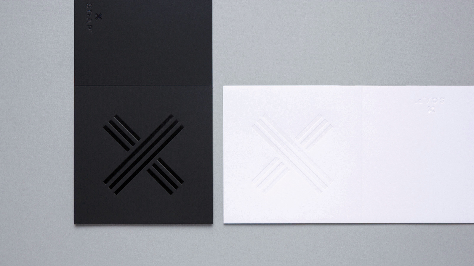
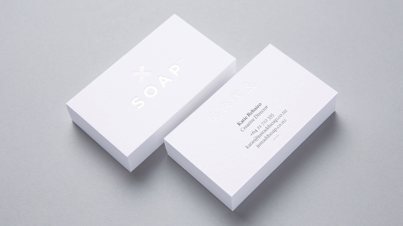
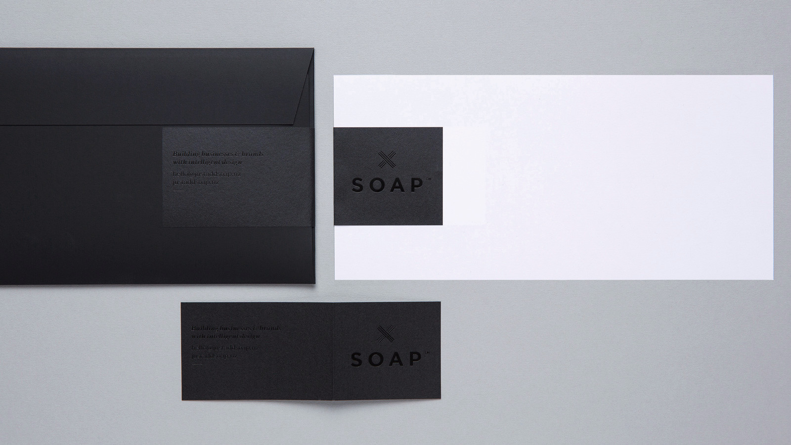
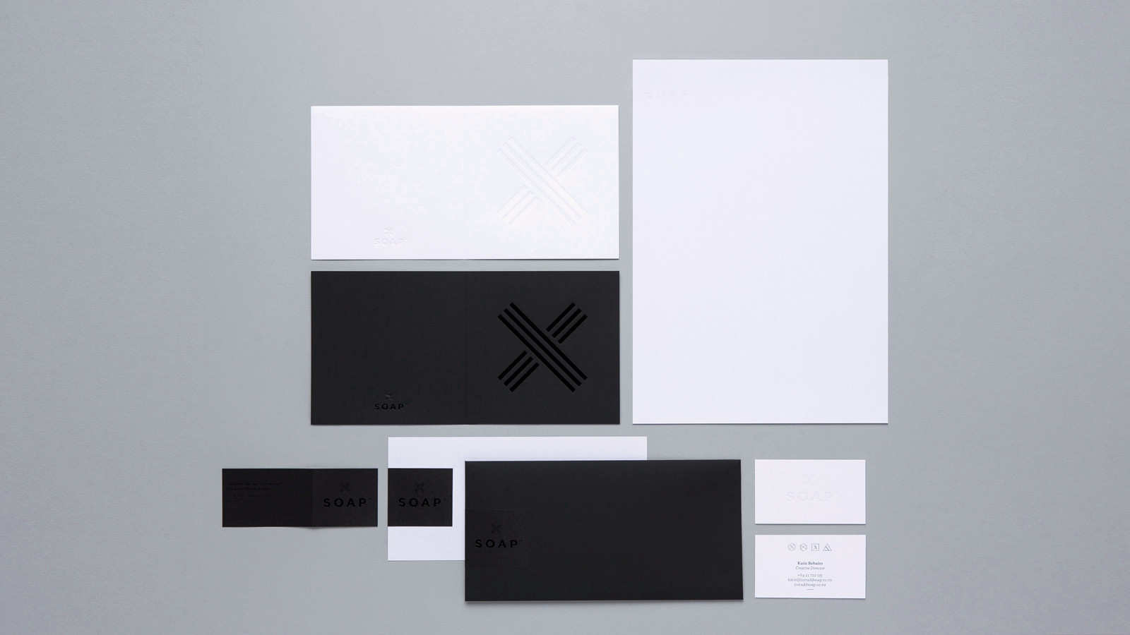
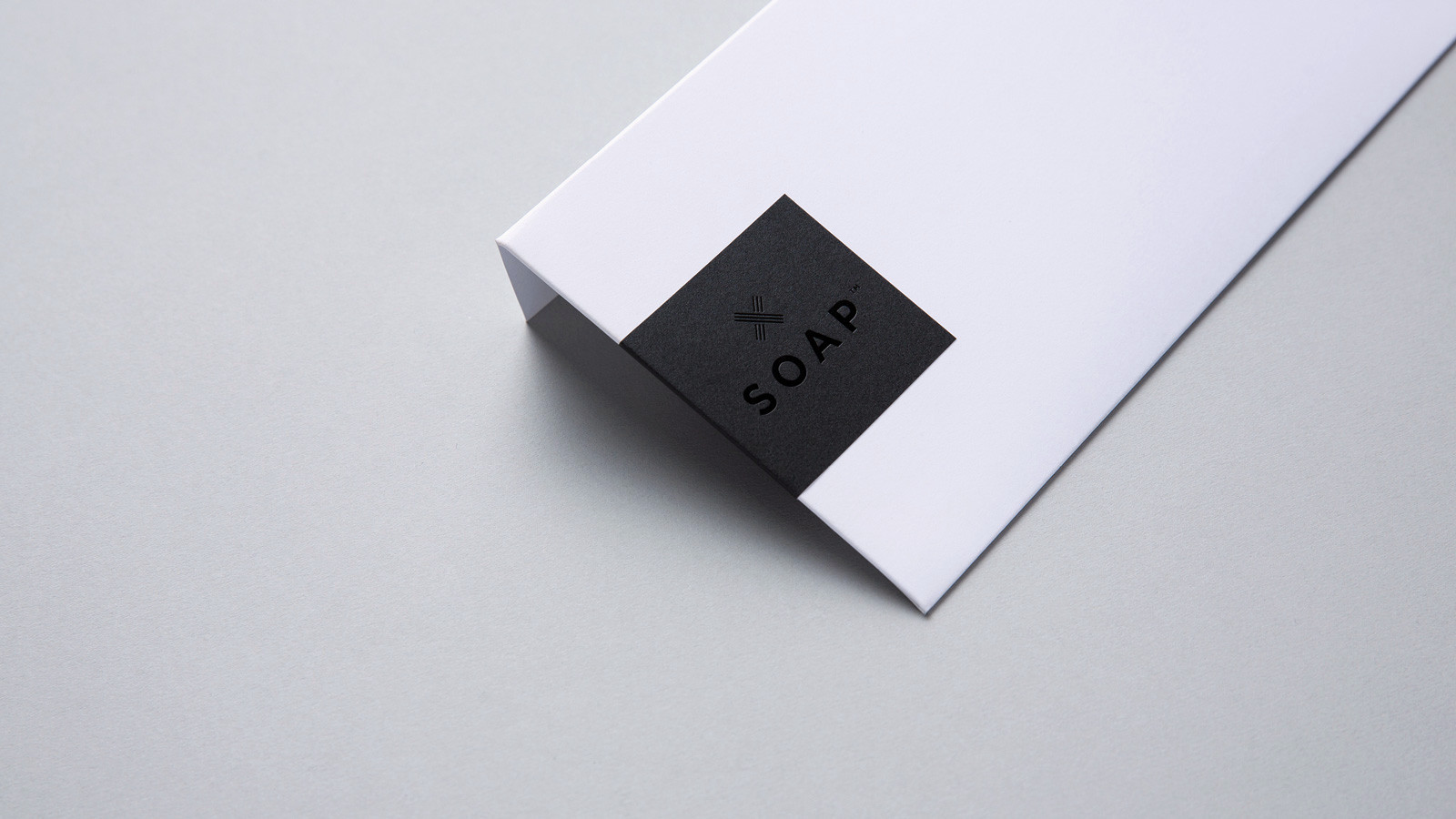
A series of maker’s marks represent our areas of expertise and nod to the level of craft that we employ in every project we engage in with our clients. Tone on tone, our main maker’s mark and logotype are foil embossed into uncoated paperstocks. A hardworking sticker was developed to be applied to multiple customer communications.
See more about the award we picked up with Logick Print for this or some promotional work we did for ourselves.
